ShipShape works — it pages, it persists a draft, it handles errors. But it still looks like a wireframe: default blue buttons, white backgrounds, system everything. In this chapter you'll give it a designed look — and here's the payoff for all that view-splitting you did in earlier chapters: because each piece of UI is its own small view, you can restyle the whole app without disturbing a single line of logic.
You'll build the styling as a set of reusable pieces — a couple of button styles, a card container, a gradient — then drop them into the screens you already have. Along the way you'll meet the SwiftUI machinery that makes custom styling clean: the ButtonStyle protocol, @ViewBuilder, generics, GeometryReader, gradients, the safe area, and two tools for adapting to any device — containerRelativeFrame and ViewThatFits.
A Palette to Style Against
Neumorphism — the look you're building — is a soft, single-color style where depth comes from shading rather than color. You pick one surface color, then a slightly lighter tint for highlights and a slightly darker shade for shadows. Shifting only the lightness of one hue is what makes it read as a physical, molded surface.
When you nudge tones within a single color, the HSL model (hue, saturation, lightness) is easier to reason about than RGB: keep hue and saturation fixed, change only lightness. A base at lightness 60%, a highlight at ~72%, and a shadow at ~30% give you a convincing raised or carved surface — all unmistakably the same color.
Create a new Swift File named Palette.swift in a new UI group, and define the colors as an extension on Color:
import SwiftUI

extension Color {
  static let surface = Color(red: 0.91, green: 0.92, blue: 0.94)
  static let surfaceShadow = Color(red: 0.73, green: 0.75, blue: 0.80)
  static let surfaceHighlight = Color.white

  static let brandTop = Color(red: 0.45, green: 0.34, blue: 0.86)    // purple
  static let brandBottom = Color(red: 0.28, green: 0.52, blue: 0.92) // blue
}Defining colors in code keeps this demo self-contained, but production apps usually add Color Sets to Assets.xcassets instead. Each color set carries a separate value for Light and Dark Mode, and with Xcode's Generate Asset Symbols build setting (on by default) you reference them the same way — Color.surface — with automatic dark-mode support for free. A set named surface-shadow even becomes Color.surfaceShadow, because Xcode camel-cases hyphenated names.
A Reusable Text Style
Both primary buttons will share one text treatment, so abstract it before you build the buttons. Put it in an extension on Text:
extension Text {
  func raisedButtonTextStyle() -> some View {
    self
      .font(.body)
      .fontWeight(.bold)
  }
}
Now any button label can call .raisedButtonTextStyle(). The win isn't the two lines you saved — it's that changing the buttons' text everywhere is now a one-line edit in a single place. That's the whole game with styling: name a look once, reuse it everywhere, change it in one spot.
The ButtonStyle Protocol
Apple knows you'll want to restyle controls, so it ships a family of style protocols — you already used one, PageTabViewStyle, on your TabView back in Chapter 2. For buttons, the protocol is ButtonStyle, and it has exactly one requirement: a makeBody(configuration:) method that returns the styled button.
Create a new group Styling under Views, and in it a new SwiftUI View file named RaisedButton.swift. Add a first, deliberately crude style:
struct RaisedButtonStyle: ButtonStyle {
  func makeBody(configuration: Configuration) -> some View {
    configuration.label
      .background(Color.red)
  }
}
configuration is the button handed to you to dress up. Its two useful members:
configuration.label— the button's content (theText, or whatever you put in the label).configuration.isPressed— aBoolthat'struewhile the user is holding the button down. You'll use it to make the button feel physical.
ButtonStyle vs PrimitiveButtonStyleButtonStyle lets you restyle a button while SwiftUI keeps handling when the tap fires. If you need to control the triggering gesture itself — say, fire on a long-press or a double-tap — reach for PrimitiveButtonStyle instead, which hands you a trigger() you call yourself. For ordinary buttons, ButtonStyle is what you want.
The Swift-y way to name a style
You could apply this with .buttonStyle(RaisedButtonStyle()), but SwiftUI's built-in styles read like .buttonStyle(.bordered). Match that with a small extension:
extension ButtonStyle where Self == RaisedButtonStyle {
  static var raised: RaisedButtonStyle { .init() }
}
Now you can write .buttonStyle(.raised) — and Xcode autocompletes it right alongside Apple's own styles.
.buttonStyle(.raised) isn't per-button — apply it to a container and every Button inside inherits it. Dropping .buttonStyle(.raised) on your ContentView would restyle every button in the app at once. You won't do that here (different buttons want different styles), but it's the fastest way to theme a whole screen. One thing to notice when you do: a styled button's text switches from the default blue accent to the primary color (black in Light Mode, white in Dark).
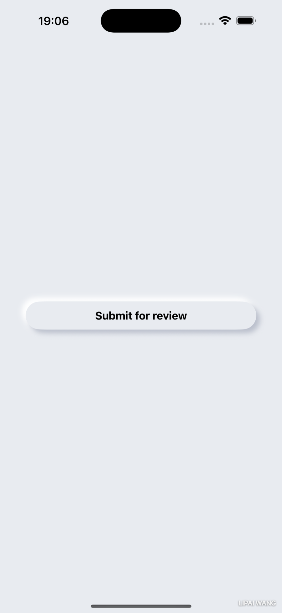
Building the Raised Button
Replace the crude red version with the real neumorphic recipe. The label takes the full width, gets some vertical padding, and sits on a Capsule lifted by two shadows:
struct RaisedButtonStyle: ButtonStyle {
  func makeBody(configuration: Configuration) -> some View {
    configuration.label
      .frame(maxWidth: .infinity)
      .padding(.vertical, 12)
      .background(
        Capsule()
          .foregroundStyle(Color.surface)
          .shadow(color: .surfaceShadow, radius: 4, x: 6, y: 6)
          .shadow(color: .surfaceHighlight, radius: 4, x: -6, y: -6)
      )
      .scaleEffect(configuration.isPressed ? 0.97 : 1)
      .animation(.easeOut(duration: 0.12), value: configuration.isPressed)
  }
}
Reading it piece by piece:
frame(maxWidth: .infinity)tells the label to take all the width its parent offers — so the button stretches edge to edge.Capsule()is the pill-shaped background. SwiftUI's shapes (Rectangle,Circle,Capsule,RoundedRectangle) fill with black by default, soforegroundStyle(Color.surface)repaints it to match the background — the button is the same color as everything else, which is the heart of neumorphism.- The two shadows are the trick. A dark shadow offset down-and-right (
x: 6, y: 6) plus a light highlight offset up-and-left (x: -6, y: -6) make the capsule look lifted toward a light source in the top-left. Drop either one and the illusion collapses. scaleEffect+configuration.isPressedsinks the button slightly while held, so a tap feels like pressing a real key.
Here's the diagram of what makeBody assembles:
.shadow(radius:) on its own gives a soft, even, all-around shadow — pleasant for a gentle lift. The fuller form, .shadow(color:radius:x:y:), lets you choose the color and push the shadow to one side with an offset. Neumorphism needs the offset form, twice, in opposite directions.
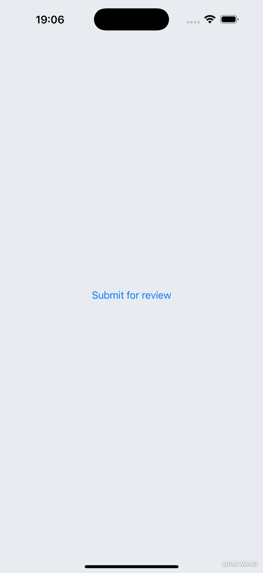
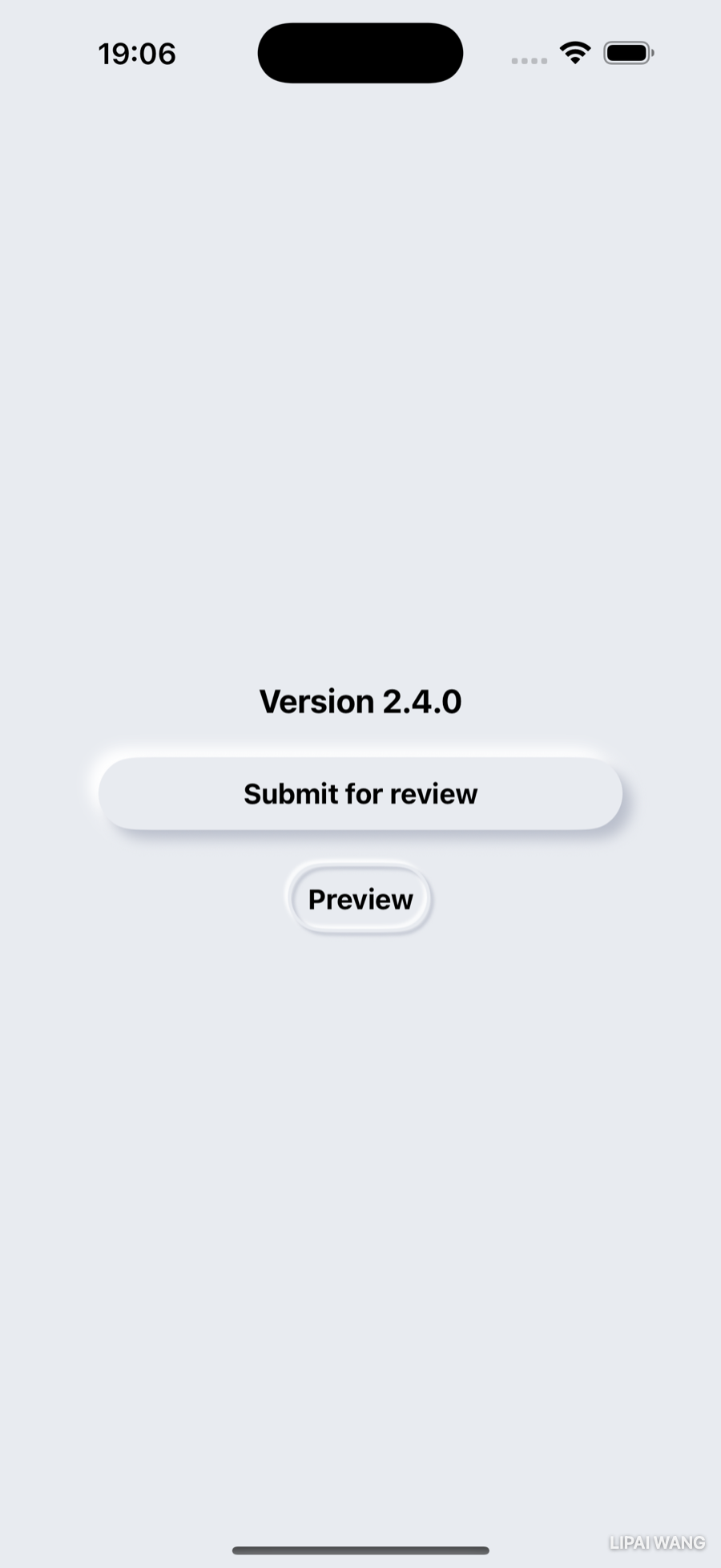
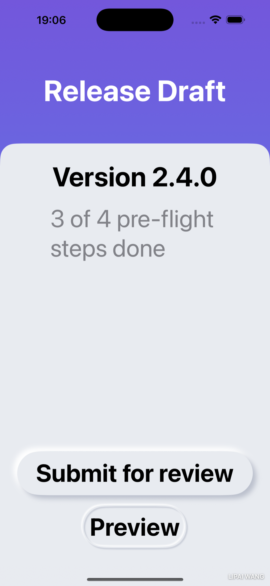
To preview just the button, set the file's #Preview to lay it on the surface:
#Preview(traits: .sizeThatFitsLayout) {
  ZStack {
    Color.surface
    Button("Submit for review") { }
      .buttonStyle(.raised)
      .padding(40)
  }
}
Compare the default button with the styled one:
Abstracting the Button With a Closure
You'll want this button in several places, each with different text and a different action. Rather than repeat the Button { } .buttonStyle(.raised) dance, wrap it in a small view configured by a closure — the same tool you met in Chapter 5, used a new way. Add this to RaisedButton.swift:
struct RaisedButton: View {
  let title: String
  let action: () -> Void

  var body: some View {
    Button(action: action) {
      Text(title)
        .raisedButtonTextStyle()
    }
    .buttonStyle(.raised)
  }
}
action is a closure of type () -> Void — takes nothing, returns nothing — that you hand straight to the Button. Because a trailing closure is the natural way to pass the last argument, call sites read beautifully:
RaisedButton(title: "Submit for review") {
  submitForReview()
}
Views as properties
There's one more readability move worth making a habit. Instead of inlining that button in a body, pull it out as a computed property:
var submitButton: some View {
  RaisedButton(title: "Submit for review") {
    submitForReview()
  }
  .padding()
}
Now body just says submitButton. As you convert a busy body into a handful of named view-properties, it stops reading like markup and starts reading like an outline of the screen.
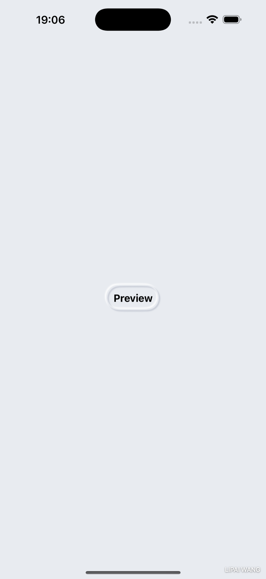
The Embossed Button
The design also calls for secondary buttons that look pressed into the surface rather than raised above it — a capsule for "Preview", and a circle for a rating control. Since the rating wraps an SF Symbol, not text, you'll build this one as a style only (so it can dress any label), not a whole new view.
Create EmbossedButton.swift in the Styling group. The embossed look strokes the shape — an outline — instead of filling it:
struct EmbossedButtonStyle: ButtonStyle {
  func makeBody(configuration: Configuration) -> some View {
    configuration.label
      .padding(10)
      .background(
        Capsule()
          .stroke(Color.surface, lineWidth: 2)
          .shadow(color: .surfaceShadow, radius: 1, x: 2, y: 2)
          .shadow(color: .surfaceHighlight, radius: 1, x: -2, y: -2)
          .offset(x: -1, y: -1)
      )
  }
}
stroke(_:lineWidth:) outlines the capsule instead of filling it; the two tight shadows on that thin outline read as a carved groove. The offset nudges the outline by half the stroke width so the label sits centered inside it.
One style, two shapes — with an enum
The rating control wants a circle, not a capsule. Let the call site choose with an enum, and a property that defaults to capsule:
enum EmbossedButtonShape {
  case capsule, circle
}

struct EmbossedButtonStyle: ButtonStyle {
  var shape: EmbossedButtonShape = .capsule
  // makeBody below…
}
Now you need makeBody to draw either a Capsule or a Circle. Pull the shape-drawing into its own method:
func outline(size: CGSize) -> some View {
  switch shape {
  case .capsule:
    Capsule()
      .stroke(Color.surface, lineWidth: 2)
  case .circle:
    Circle()
      .stroke(Color.surface, lineWidth: 2)
  }
}
This won't compile yet — and the error is one of the most important concepts in SwiftUI.
@ViewBuilder
The method promises to return some View — one concrete type. But the switch returns a Capsule in one branch and a Circle in another, decided at run time. The compiler can't pick a single type, so it refuses.
The fix is the @ViewBuilder attribute. A view builder is a result builder: it takes the views you list (or branch between) and quietly bundles them into one composite type, so a function can "return different view types" and still satisfy some View. This is exactly how VStack { ... }, HStack { ... }, and even .toolbar { ... } accept a grab-bag of child views. Mark the method and it compiles:
@ViewBuilder
func outline(size: CGSize) -> some View {
  switch shape {
  case .capsule:
    Capsule().stroke(Color.surface, lineWidth: 2)
  case .circle:
    Circle().stroke(Color.surface, lineWidth: 2)
  }
}@ViewBuilder constantly — usually invisiblyEvery SwiftUI container closure is a @ViewBuilder: that's why a VStack can hold a Text, an Image, and a Button with no wrapping. You only have to write the attribute yourself when you build your own view-returning function or property that branches between types — like outline(size:) here, or the container you'll build next.
Sizing the circle with GeometryReader
A circle should be as wide as the label is tall (or wide — whichever is larger), so it hugs an icon snugly. To size against the label you need to measure it, and GeometryReader reports the size of the space it's given. Wrap the outline in one and pass the measured size down:
func makeBody(configuration: Configuration) -> some View {
  configuration.label
    .padding(10)
    .background(
      GeometryReader { geo in
        outline(size: geo.size)
          .shadow(color: .surfaceShadow, radius: 1, x: 2, y: 2)
          .shadow(color: .surfaceHighlight, radius: 1, x: -2, y: -2)
          .offset(x: -1, y: -1)
      }
    )
}
Then make the circle take the larger dimension and recenter it over the label:
case .circle:
  let diameter = max(size.width, size.height)
  Circle()
    .stroke(Color.surface, lineWidth: 2)
    .frame(width: diameter, height: diameter)
    .offset(x: -1, y: (min(size.width, size.height) - diameter) / 2)
Finally, add the .buttonStyle(.embossed) conveniences:
extension ButtonStyle where Self == EmbossedButtonStyle {
  static var embossed: EmbossedButtonStyle { .init() }
  static func embossed(_ shape: EmbossedButtonShape) -> EmbossedButtonStyle {
    .init(shape: shape)
  }
}
A capsule "Preview" button, and a row of circular rating pips:
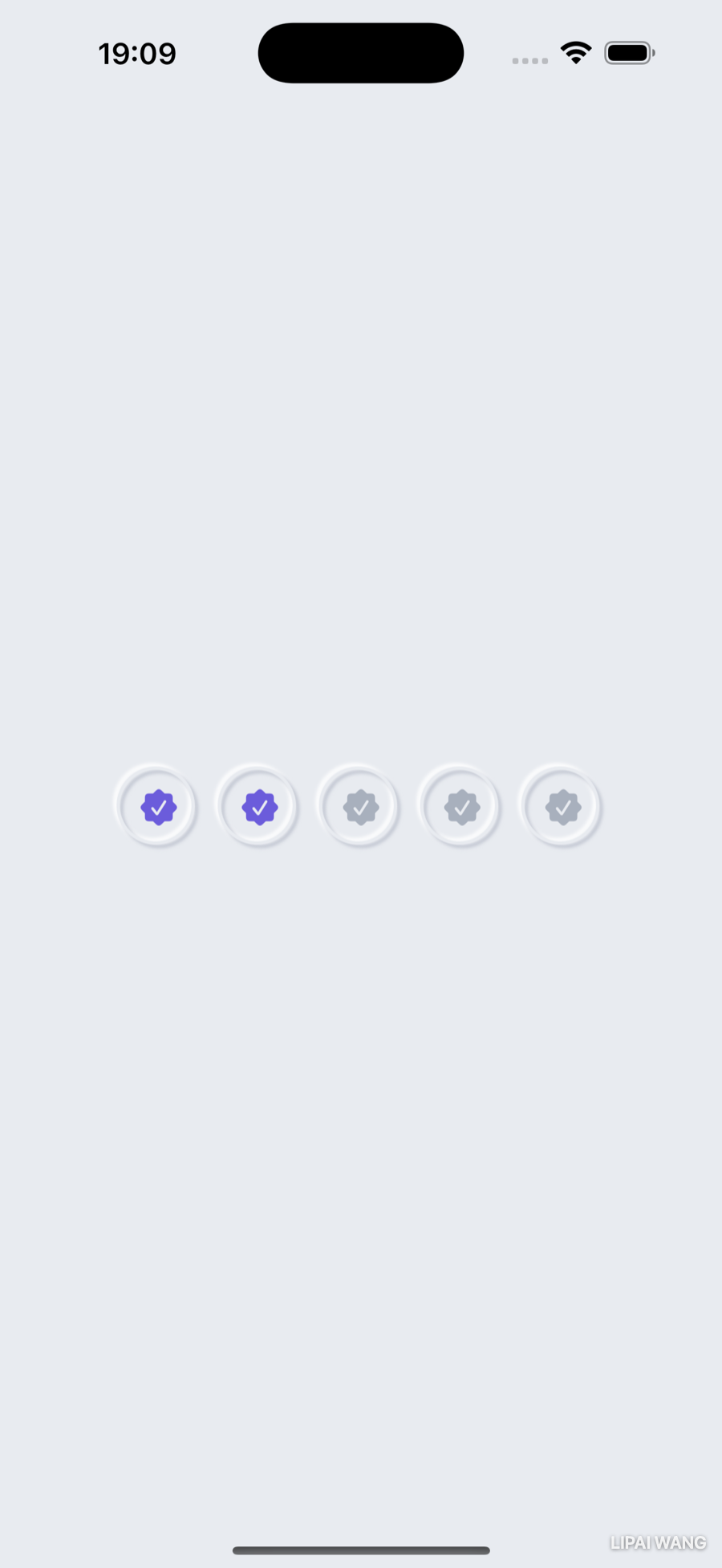
Use the circle style for a tappable rating, and the fill animates as the user taps — a quick check that the embossed icon buttons feel alive:
A Generic Container Card
The designed screens share a card: a rounded gray panel that everything sits on. You could copy that background onto every screen — or build a container view that wraps any content, the same way VStack wraps any content. To accept any views, it has to be generic.
Create ContainerView.swift in the Styling group:
struct ContainerView<Content: View>: View {
  let content: Content

  init(@ViewBuilder content: () -> Content) {
    self.content = content()
  }

  var body: some View {
    content
  }
}
Two new ideas in four lines:
<Content: View>is a generic type parameter — a placeholder for "whatever view you put inside." Generics let one type work with many others without losing type safety; hereContentbecomes the exact type of the content you pass. (You'll go deeper on generics in a later chapter.)- The initializer takes a
@ViewBuilderclosure that returnsContent. That@ViewBuilderattribute is why callers can pass a stack of views —ContainerView { Text(...); Button(...) }— exactly like aVStack. The init runs the closure and stores the result.
Right now it just returns its content. Give it the card look — a rounded rectangle, with the bottom corners squared off so it can sit flush against the screen's bottom edge:
var body: some View {
  ZStack {
    RoundedRectangle(cornerRadius: 25)
      .foregroundStyle(Color.surface)
    VStack {
      Spacer()
      Rectangle()
        .frame(height: 25)
        .foregroundStyle(Color.surface)
    }
    content
  }
}
The Rectangle at the bottom is a deliberate trick: it paints over the rounded bottom corners with square ones, so only the top corners stay rounded. Now any content you pass sits on the same card:
A Gradient Header
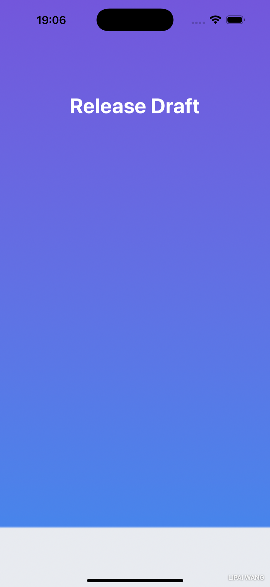
Flat gray is calm, but the header deserves some brand color. SwiftUI gradients are just an array of colors and a direction. Create GradientBackground.swift in the Styling group:
struct GradientBackground: View {
  var gradient: Gradient {
    Gradient(colors: [.brandTop, .brandBottom])
  }

  var body: some View {
    LinearGradient(gradient: gradient, startPoint: .top, endPoint: .bottom)
  }
}
LinearGradient blends from startPoint to endPoint — .top to .bottom here. Want it diagonal? Use .topLeading and .bottomTrailing. Drop it behind a screen's content (a .background(GradientBackground()) on the outer stack) and the purple-to-blue band appears behind the header.
The safe area
You'll notice the gradient stops short of the screen edges — it leaves the safe area (the strip under the Dynamic Island up top, and the home-indicator area at the bottom) uncovered. The safe area is where you must never put interactive UI, because the system might cover it. But backgrounds are welcome to extend into it. Push the gradient to every edge:
LinearGradient(gradient: gradient, startPoint: .top, endPoint: .bottom)
  .ignoresSafeArea()
Gradient stops for a hard line
Filling the whole screen with purple-to-blue looks odd at the very bottom. The fix: have the gradient turn to the surface color for the last sliver, with a crisp edge rather than a blend. You control where colors sit with stops:
var gradient: Gradient {
  Gradient(stops: [
    .init(color: .brandTop, location: 0),
    .init(color: .brandBottom, location: 0.9),
    .init(color: .surface, location: 0.9),
    .init(color: .surface, location: 1)
  ])
}
A Gradient.Stop pins a color to a location from 0 (start) to 1 (end). The brand colors blend across the top 90%; then two stops at the same location (0.9) force a hard line — no blend — into the surface color for the rest. (That same two-stops-at-one-location trick is how you'd make a striped background.)
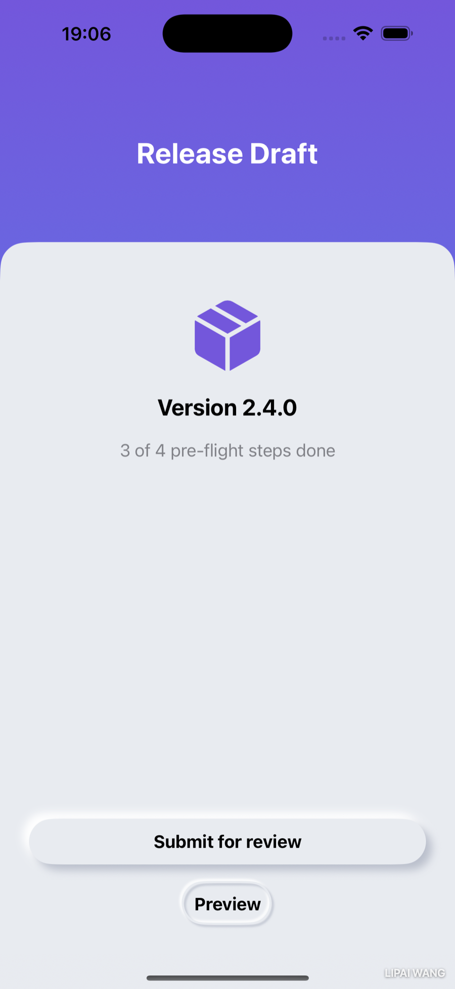
Adapting to Every Screen
Your styling is in place. Now make the layout hold up — on a small phone, and at large accessibility text sizes.
Proportional sizing with containerRelativeFrame
The header should own the top 20% of the screen and the card the bottom 80%, on every device. You could compute that with GeometryReader, but SwiftUI has a direct tool: containerRelativeFrame. It sizes a view relative to its container along an axis:
header
  .containerRelativeFrame(.vertical) { height, _ in height * 0.2 }

ContainerView { /* card content */ }
  .containerRelativeFrame(.vertical) { height, _ in height * 0.8 }
You pick the axis (.vertical), and the closure hands you the container's height (the second parameter, the axis, you ignore here) so you can return your share of it. Wrap the two in a VStack(spacing: 0) so there's no gap between the header band and the card:
Alternative layouts with ViewThatFits
That card looks great at the default text size. Crank Dynamic Type up to an accessibility size, though, and the bigger text needs room the 80% card doesn't have — content gets clipped. The fix is to offer SwiftUI alternatives and let it pick the first that fits, with ViewThatFits:
ViewThatFits {
  card(showArt: true)   // preferred: with the shipping-box art
  card(showArt: false)  // fallback: text and buttons only
}
ViewThatFits tries each child in order and renders the first one that fits the available space. At normal sizes the art-included layout fits and wins; at large accessibility sizes it doesn't, so SwiftUI falls back to the art-free layout — keeping the version, status, and buttons reachable instead of clipped.
In the canvas, switch on Dynamic Type Variants and pick a small device like iPhone SE to see your layout at every accessibility text size at once. A design that's gorgeous on an iPhone 16 Pro at the default size can hide its primary button on an SE at the largest size. ViewThatFits is how you handle that gracefully — by deciding what's essential (the buttons) and what's expendable (the decorative art) when space runs out.
Here's the same screen at a large accessibility text size — the art has dropped away, and every control is still in reach:
Key Points
- Because each piece of UI is its own small view, you can restyle without touching logic. Build the look as reusable pieces, then drop them in.
- Abstract repeated looks into modifiers (
extension Text { func …Style() }) so one edit restyles everywhere. - Conform to
ButtonStyleand implementmakeBody(configuration:); reach forconfiguration.labelandconfiguration.isPressed. Add astatic varextension so you can write.buttonStyle(.raised). A style applied to a container cascades to every button inside. - Neumorphism is one surface color plus a lighter highlight and a darker shadow. A raised look uses two offset shadows (dark down-right, light up-left); an embossed look strokes the shape with tight inset shadows.
@ViewBuilderlets a function or property return different view types (e.g. aswitchover a shape enum) and unify them assome View. SwiftUI's containers use it everywhere; you write it when your own view-returning code branches between types.GeometryReadermeasures the space a view is given — use it to size one view against another, like a circle to its label.- A generic
ContainerView<Content: View>with a@ViewBuilderinitializer is your ownVStack-style wrapper: pass any content, apply shared formatting once. - Gradients are an array of colors (or
Gradient.Stops) plus a direction. Two stops at the same location make a hard line. Backgrounds may extend into the safe area with.ignoresSafeArea(); interactive UI must not. - Size views proportionally with
containerRelativeFrame, and offer fallback layouts withViewThatFitsso your design survives small screens and large Dynamic Type.
Challenge: Style the Header
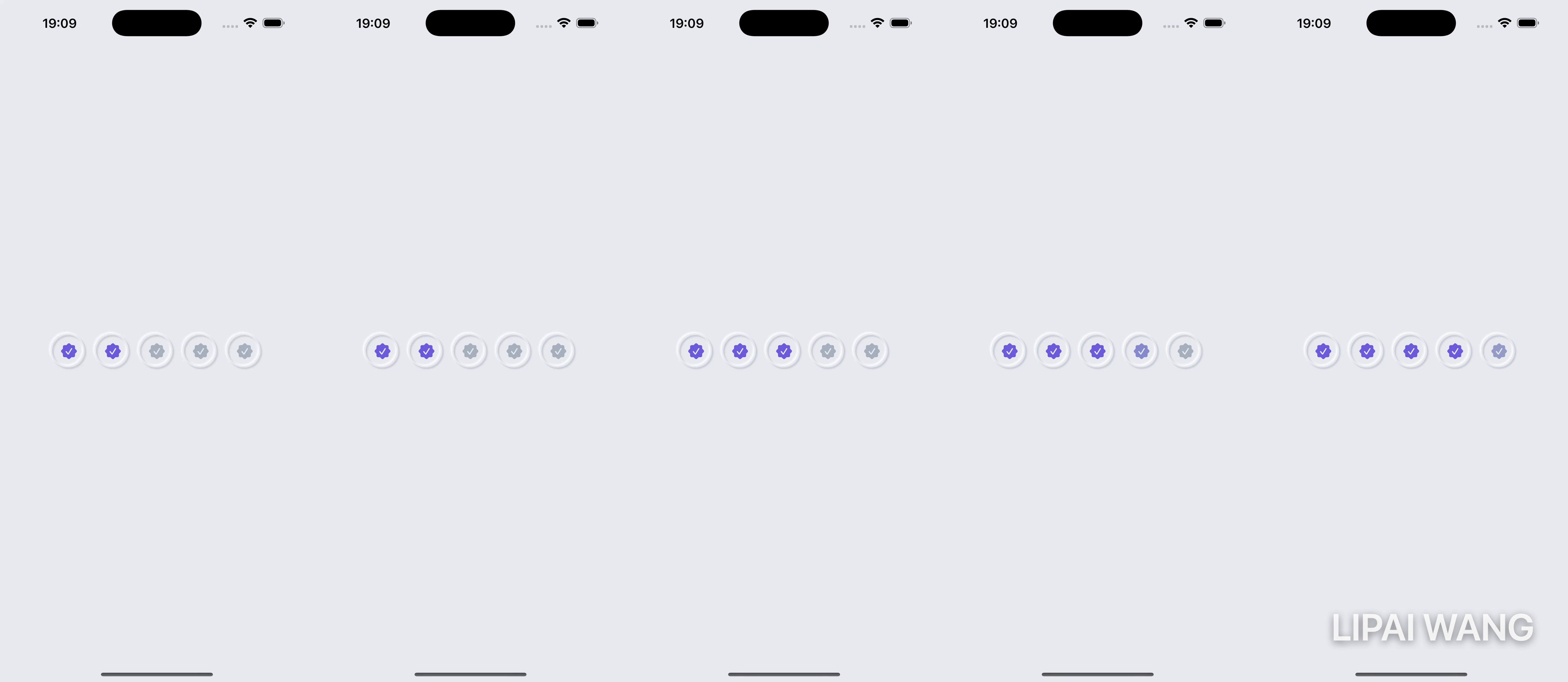
You've styled the buttons, the card, and the background — now finish the look by restyling HeaderView, the page indicator that rides at the top of every screen.
- Replace the numbered page indicators with circles. The current page gets a solid pip; the others get a faded one — use
.opacity(_:)(a value between 0 and 1) for the faded state. - Sit the header on the gradient (it already shows through) and make sure the circle pips read clearly in white against the purple.
- Stretch: apply the same
ContainerView+containerRelativeFrame(.vertical)20/80 split to one of your other screens (the Step view, say) so the whole app shares the designed frame. Preview it on an iPhone SE with the largest Dynamic Type variant and confirm nothing important is clipped — add aViewThatFitsfallback if it is.
Build it, preview it across a few devices and text sizes, and ShipShape goes from "wireframe that works" to "app you'd be glad to ship."
ShipShape now looks designed — neumorphic buttons, a card-based layout, a brand gradient, and a frame that adapts from the smallest phone to the largest text. But it's still static: pages snap, ratings pop, screens cut from one to the next. Next you'll add animation and transitions — easing the rating fill, sliding screens in, and giving the Ready-to-Ship celebration some motion — so the app doesn't just look good standing still, it feels good in the hand.

Ultimate iOS Bootcamp: Master Swift & SwiftUI App THE HARD WAY
Ship your apps faster
When you're ready to publish your Swift app to the App Store, Simple App Shipper handles metadata, screenshots, TestFlight, and submissions — all in one place.
Try Simple App Shipper