In the last chapter you built ShipShape's busiest screen — the Step view, with its header, clip player, timer, buttons, and rating row. Once you can lay out the most crowded page, the rest come easy. Three full-screen views are still placeholders:
- Welcome — the friendly first page that greets the user.
- History — a dated log of the prep steps they've finished.
- Ready to Ship! — the celebration screen for when every step is done.
In this chapter you'll lay out History and Welcome, build the data model behind the history log, then finish the prototype yourself by creating the Ready to Ship! screen as a challenge. Along the way you'll meet Form, DateFormatter, ZStack, and a pair of refactoring tricks that keep your code honest.
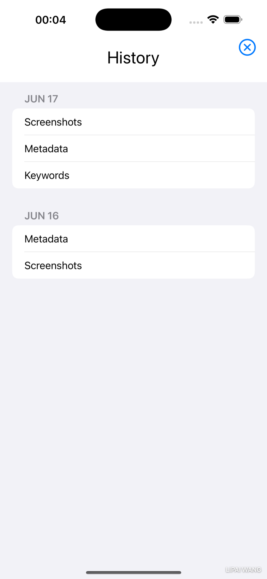
Laying Out the History View
You'll start with a hard-coded mock-up and swap in a real data model once the layout looks right. Building UI against fake data first is a good habit: the screen takes shape while the model is still a sketch, and you only commit to a data structure after you've seen what the view actually needs from it.
Create a new SwiftUI View file in the Views group named HistoryView.swift. Above body, add some throwaway sample data — two days' worth of finished steps:
let today = Date()
let yesterday = Date().addingTimeInterval(-86_400)

let stepsToday = ["Screenshots", "Metadata", "Keywords", "Final QA"]
let stepsYesterday = ["Screenshots", "Metadata", "Keywords"]
Date() is right now; addingTimeInterval(-86_400) rolls back one day, because there are 86,400 seconds in a day. (The underscores are just digit separators — 86_400 and 86400 are the same number, but the first is easier to read.)
Replace the boilerplate Text("Hello, world!") with a titled VStack:
VStack {
  Text("History")
    .font(.title)
    .padding()
  // Step log goes here
}
That's the header. Before you fill in the log, those two dates need to look like dates a human would write.
Formatting dates with an extension
A raw Date is just a number of seconds, so printing one gives you something like 2026-06-17 09:41:00 +0000. To turn it into Jun 17, you configure a DateFormatter.
Date really isA Date stores a single instant as a number of seconds relative to a fixed reference point (January 1, 2001, UTC). It has no notion of "month" or "time zone" on its own. A DateFormatter is what renders that instant as calendar text in a particular style and zone. Foundation ships built-in styles (.short, .medium, .long, .full), or you can supply your own pattern string.
Back in Chapter 3 a callout mentioned you can extend any type, even ones built into the SDK like Date and Image. Time to do exactly that. Create a new Swift File (not a SwiftUI View — this is a helper, not a view) named DateExtension.swift, and add:
import Foundation

extension Date {
  func formatted(pattern: String) -> String {
    let formatter = DateFormatter()
    formatter.dateFormat = pattern
    return formatter.string(from: self)
  }
}
DateFormatter has only an empty initializer: you create one, then configure the properties you care about. Here you set dateFormat to the caller's pattern, then string(from:) renders self — the date you called the method on — as text.
The pattern is a small language of its own. "MMM d" means three letters for the month (Jun, Oct) and one digit for the day with no leading zero (7, 17). Ask for "MM dd" instead and you get zero-padded numbers for both: 06 07. You don't have to think about time zones unless you want to — the formatter defaults to the user's current zone, which is almost always what you want.
Documenting it with Quick Help
Your formatted(pattern:) reads almost like a built-in method now. Make it feel built-in by documenting it. Add a documentation comment directly above the method:
/// Renders the date as text using a custom pattern string.
/// - Parameter pattern: A date pattern like `"MMM d"` or `"MM dd"`.
/// - Returns: The formatted date, in the user's current time zone.
func formatted(pattern: String) -> String {
Those triple-slash /// comments are special. Option-click the method name anywhere you call it and Xcode shows your summary in Quick Help, formatted exactly like Apple's own API docs — parameters, return value, and all. It's worth documenting every non-obvious method you write this way; future-you reading the call site will thank present-you. Apple's Markup Formatting Reference lists everything you can put in one.
A Form with sections
SwiftUI has a container that styles its contents into the neat, grouped rows you see on a Settings screen — perfect for a dated log. It's called Form. Inside the VStack, replace the // Step log goes here comment with:
Form {
  Section(
    header:
      Text(today.formatted(pattern: "MMM d"))
        .font(.headline)) {
    // today's steps
  }
  Section(
    header:
      Text(yesterday.formatted(pattern: "MMM d"))
        .font(.headline)) {
    // yesterday's steps
  }
}
Each Section gets a header — the day's date in headline font, thanks to the extension you just wrote. Refresh the preview and you'll see two dated sections, empty for now, with whatever dates today and yesterday happen to be.
Looping over a collection
To list the steps under each date, loop over the arrays with ForEach. In Chapter 3 you looped over a range (ForEach(0 ..< 5)) and over an array's indices (ForEach(Step.steps.indices, id: \.self)). Here you'll loop over the array's elements. Replace // today's steps with:
ForEach(stepsToday, id: \.self) { step in
  Text(step)
}
This uses the ForEach initializer that takes the data, a key path to each element's identifier, and a closure that builds a view per element. stepsToday is the data; \.self is the key path — it tells ForEach that each String is its own unique identifier. As the loop visits each element it binds it to step, which you show in a Text.
Do the same for the other section — replace // yesterday's steps with the near-identical loop over stepsYesterday:
ForEach(stepsYesterday, id: \.self) { step in
  Text(step)
}
Refresh the preview to admire your two-day log.
Two hard-coded sections are fine for a mock-up, but the real log has any number of days, each with any set of steps. Hard-coded today/yesterday properties can't grow. You need a data structure you can loop over: for each day, a Section; inside it, a loop over that day's steps.
Modeling the History Data
Time to replace the loose dates and string arrays with a proper model.
Mini-exercise
Before reading on, jot down what one entry in the history log actually holds. A single day of shipping work carries which pieces of data? (You already saw them in the mock-up — a date, and the steps finished that day.) Naming them yourself first makes the struct below feel inevitable rather than handed to you.
A ShipDay and a HistoryStore
Create a new Swift File named HistoryStore.swift — a model, not a view, so plain Swift. Then select it together with Step.swift and group them into a new folder named Model (right-click ▸ New Group from Selection). Models living apart from Views keeps the project easy to navigate.
Below import Foundation, add:
struct ShipDay: Identifiable {
  let id = UUID()
  let date: Date
  var steps: [String] = []
}

struct HistoryStore {
  var shipDays: [ShipDay] = []
}
A ShipDay is one day's record: the date, plus the names of the steps the user finished that day. HistoryStore holds the whole log — an array of ShipDay values you'll loop over in HistoryView.
Notice ShipDay conforms to Identifiable. That protocol is the easy way to make a type loopable.
Identifiable matters for ForEachWhen ForEach loops over a collection, it needs a stable way to tell the elements apart — so it can animate insertions, track selections, and redraw only what changed. The simplest way to provide that is to conform the element's type to Identifiable and give it an id property. UUID() mints a brand-new unique value every time a ShipDay is created, so no two days ever collide. With Identifiable in place, you can loop over [ShipDay] without the id: \.self argument you needed for the String arrays.
In a later chapter you'll extend HistoryStore with methods to save the log to disk and load it back. For now you just need realistic data to design against.
Sample data in an extension
Add a method that fills the store with a couple of sample days. Put it in an extension, outside HistoryStore's braces:
extension HistoryStore {
  mutating func seedSampleData() {
    shipDays = [
      ShipDay(
        date: Date().addingTimeInterval(-86_400),
        steps: [
          Step.steps[0].stepName,
          Step.steps[1].stepName,
          Step.steps[2].stepName
        ]),
      ShipDay(
        date: Date().addingTimeInterval(-86_400 * 2),
        steps: [
          Step.steps[1].stepName,
          Step.steps[0].stepName
        ])
    ]
  }
}
Three things to notice here:
- It reuses your
Stepmodel. Instead of retyping"Screenshots", the steps come fromStep.steps— the catalog you built in Chapter 3. If you rename a step there, the sample log follows automatically. One source of truth. - It's
mutating.HistoryStoreis a struct, andseedSampleData()changes one of its stored properties (shipDays). Methods on a struct that modify its own properties must be markedmutating, so the compiler knows the call site needs avar, not alet. - It's in an extension. Building the sample data isn't part of what a store fundamentally is, so it lives apart from the core definition. There's a second, sneakier reason for the extension, too — coming up next.
Debug-only, with a compiler directive
You want this fake data while you're building, but never in the version users download. Add an initializer to the main HistoryStore that seeds data only in debug builds:
init() {
  #if DEBUG
  seedSampleData()
  #endif
}
#if DEBUG is a compiler directive: the code between #if and #endif is only compiled when the active build configuration is Debug. Run from Xcode and you're in Debug, so you get sample data; an exported Release build skips it entirely.
Debug and Release are build configurations. To see which one a run uses, click the scheme menu (next to the run-destination picker), choose Edit Scheme…, and open the Info tab — the Build Configuration row shows Debug for Run and Release for Archive. Compiler directives like #if DEBUG let one codebase behave differently in each.
Move dev code into Preview Content
Better still: keep development-only code out of the app target entirely. Xcode gives you a group for exactly this — Preview Content — and nothing in it ships in your release build.
In the Preview Content group, create a new Swift File named HistoryStore+SampleData.swift, and move the whole extension HistoryStore { … } block into it.
That's the second reason seedSampleData() lived in an extension: extensions can sit in separate files. You never have to scroll past sample data to find the real store, and because the file is under Preview Content, the seeding code physically can't end up in what users install. Your #if DEBUG initializer and the Preview-Content extension reinforce each other — belt and suspenders.
Drive HistoryView from the store
Back in HistoryView.swift, delete the four mock properties (today, yesterday, stepsToday, stepsYesterday) and add the store in their place:
let history = HistoryStore()The store now owns everything those loose properties used to. Replace the entire Form with a loop over the store's days:
Form {
  ForEach(history.shipDays) { day in
    Section(
      header:
        Text(day.date.formatted(pattern: "MMM d"))
          .font(.headline)) {
      ForEach(day.steps, id: \.self) { step in
        Text(step)
      }
    }
  }
}
Look closely at the two ForEach calls. The outer one loops over history.shipDays with no id: argument — it doesn't need one, because ShipDay is Identifiable. The inner one loops over day.steps, which are plain Strings with no built-in identity, so it still needs id: \.self. Same loop, different identity story.
Refresh the preview: the same two-day log, now produced by your model instead of hand-typed properties — and ready to display ten days or a hundred without another line of layout code.
Dismissing the History Sheet
In the next chapter you'll present HistoryView as a modal sheet, which means it needs a way to close itself. The convention is a small ✕ in the top-right corner. The trick is to add it without disturbing the title-and-Form layout you just built — and for that, you reach for ZStack.
A button in its own layer
HStack arranges views along the x-axis; VStack along the y-axis; ZStack stacks them along the z-axis, perpendicular to the screen — think of it as a depth stack, one layer on top of another. Putting the dismiss button in its own layer lets it float over the corner while the title and form lay themselves out as if it weren't there.
Right-click the VStack and choose Embed in ZStack, then add the button as the first child, above the VStack:
ZStack {
  Button(action: {}) {
    Image(systemName: "xmark.circle")
  }
  VStack {
    // title + Form
  }
}
Switch the preview to Selectable mode and you'll see the button's outline — but only the outline. Because you declared it first, it's on the bottom layer, hidden behind the VStack. (Counter-intuitive at first: picture laying the first view flat on a table, then stacking each later view on top.) It's also dead-center, since the default ZStack alignment is .center. You're about to fix both.
Stack alignment
Every stack takes an alignment, but each kind expects different values:
VStackalignment is horizontal:.leading,.center,.trailing.HStackalignment is vertical:.top,.center,.bottom,.firstTextBaseline,.lastTextBaseline.ZStackneeds both — pass separate horizontal and vertical values, or one combined value like.topTrailing.
Push the button into the top-right corner by setting the ZStack's alignment:
ZStack(alignment: .topTrailing) {Then size it up and ease it off the edge with two modifiers on the Button:
Button(action: {}) {
  Image(systemName: "xmark.circle")
}
.font(.title)
.padding(.trailing)
The button is now a visible ✕ in the corner. The ZStack's .topTrailing only positions children that don't set their own alignment, so the VStack of title and form is unaffected — exactly the isolation you wanted. HistoryView is done for now.
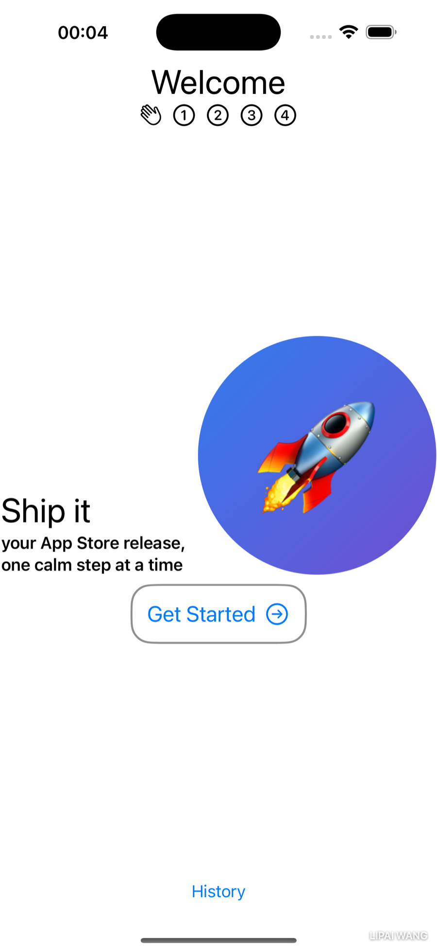
Laying Out the Welcome View
Open WelcomeView.swift. Welcome is the first page of the paged TabView, so it should wear the same header as the Step pages. Replace the boilerplate Text with:
HeaderView(titleText: "Welcome")Wait — titleText? Your Chapter 3 HeaderView takes stepName. Using it here surfaces two problems:
- There's no page indicator for the Welcome page — the header shows numbers 1–4 for the four steps, but Welcome isn't one of them.
stepNameis a poor label for the word "Welcome." Welcome isn't a step.
You'll fix both by refactoring HeaderView.
Refactoring HeaderView
The missing indicator. Open HeaderView.swift. The app has exactly one non-step page, so just add one more "page number" — a friendly wave. Duplicate the first Image in the page-number HStack, then change the now-first one:
HStack {
  Image(systemName: "hand.wave")
  Image(systemName: "1.circle")
  Image(systemName: "2.circle")
  Image(systemName: "3.circle")
  Image(systemName: "4.circle")
}
.font(.title2)
The wave reads as "you are here, at the start."
The misnamed parameter. stepName should really be a generic page title. You could hunt down every stepName by hand and decide case by case whether to change it — and in a bigger app you'd miss one, or change one you shouldn't. Let Xcode do it safely instead. Right-click the first stepName, choose Refactor ▸ Rename…, and type titleText. Xcode highlights every affected spot across three files — the declaration, the Text(stepName) usage, the #Preview, and the call site in StepView.swift — and changes them together when you click Rename.
After the rename, HeaderView reads:
let titleText: String
// …
Text(titleText)
In StepView.swift the call updated itself to HeaderView(titleText: step.stepName), and the WelcomeView line you wrote a moment ago — HeaderView(titleText: "Welcome") — now matches. The user sees a wave icon; the programmer sees a parameter that means what it says.
Rename understands Swift. It changes the symbol — the declaration and every reference to it — and leaves unrelated text that merely contains the same letters alone. A blind find-and-replace can't tell a parameter named stepName from the word "stepName" in a comment or an unrelated property. Reach for Rename whenever you change a name that's used in more than one place.
Layering the Welcome screen
Welcome wants three things at once: the header pinned to the top, a History button at the bottom, and a marketing message floating in the center, independent of how tall the other two are. Same move as HistoryView: put the header and button in one layer and shove them apart with a Spacer; put the centered content in a second layer.
Embed HeaderView in a VStack, embed that in a ZStack, then add the spacer and button:
ZStack {
  VStack {
    HeaderView(titleText: "Welcome")
    Spacer()
    Button("History") { }
      .padding(.bottom)
  }
}
The Spacer expands to fill the gap, pushing the header up and the History button down; the bottom padding keeps the button off the very edge.
Adding an image
Now fill the middle. Add a second layer to the ZStack (above or below the first VStack — order doesn't matter, the two layers don't overlap):
VStack {
  HStack {
    VStack(alignment: .leading) {
      Text("Ship it")
        .font(.largeTitle)
      Text("your App Store release, one calm step at a time")
        .font(.headline)
    }
  }
}
The inner VStack holds two Text views at different sizes, left-justified by alignment: .leading. It sits in an HStack because you're about to put an image beside the text, and that HStack sits in an outer VStack because a call-to-action button is coming below.
For the prototype you need one squarish image named launch in Assets.xcassets — a screenshot of your own app, your app icon, a stock illustration, anything. Open the Library with Shift-Option-Command-L, switch to the media tab, and drag launch straight into the code editor, dropping it just below the VStack of two Text views so it lands inside the HStack. You'll swap in something polished later.
After the drop, the HStack reads:
HStack {
  VStack(alignment: .leading) {
    Text("Ship it")
      .font(.largeTitle)
    Text("your App Store release, one calm step at a time")
      .font(.headline)
  }
  Image("launch")
}
Modifying the image
The raw image is the wrong size, and stretching it would distort it. Three modifiers fix that, in order:
Image("launch")
  .resizable()
  .aspectRatio(contentMode: .fill)
  .frame(width: 240, height: 240)
  .clipShape(Circle())
.resizable() lets the image scale at all. .aspectRatio(contentMode: .fill) makes it fill its frame while keeping its proportions (no squashing). .frame(width: 240, height: 240) sets that frame. .clipShape(Circle()) trims it to a circle — a nice, friendly touch for a welcome screen.
A custom image modifier
You'll reach for that resizable → aspectRatio → frame trio constantly — only the numbers change. Bundle it into a custom modifier so you Don't Repeat Yourself. Create a new Swift File named ImageExtension.swift:
import SwiftUI

extension Image {
  func filled(width: CGFloat, height: CGFloat) -> some View {
    self
      .resizable()
      .aspectRatio(contentMode: .fill)
      .frame(width: width, height: height)
  }
}
It extends Image, so self is whichever image you call it on. Now collapse the three modifiers into one:
Image("launch")
  .filled(width: 240, height: 240)
  .clipShape(Circle())
Same result, less noise — and the next time you need a sized, aspect-correct image, it's one call away.
Remember the Chapter 3 note that you can add methods to types you didn't write, even Apple's? You've just done it twice: formatted(pattern:) on Date and filled(width:height:) on Image. Once an extension is in scope, its methods are indistinguishable from the built-in ones — autocompletion offers them, Quick Help documents them, the dot syntax just works.
A button with text and an image
The last piece of the center layer is a call-to-action. Its label needs a Get Started prompt and a right-arrow to hint that you can also swipe to the first step. Add it inside the center VStack, below the HStack:
Button(action: { }) {
  Text("Get Started")
  Image(systemName: "arrow.right.circle")
}
.font(.title2)
.padding()
This looks different from the plain Button("History") { } buttons you've written — and it's worth understanding why.
Two ways to make a Button
The full Button signature is:
Button(action: () -> Void, label: () -> Label)actionis the code that runs on tap — a closure, so it can be more than one statement.labelis the view that describes the button — also a closure, so it can be more than one view.
Every button you'd written before this used the simplest form, Button("History") { }. That's syntactic sugar for the special case where the label is just a string: the string is the label, and the trailing closure is the action. It reverses the official parameter order, and it only works when the label is a lone String.
The moment you want more than a string in the label — here, a Text and an Image — you use the general form: the action goes in the first parameter, and the label content goes in the trailing closure (where the Text and Image become an implicit HStack).
When the last argument to a function is a closure, you can move it outside the parentheses. Button(action: { }) { Text("Get Started") } is the same call as Button(action: { }, label: { Text("Get Started") }) — the label closure just trails behind. That's why both Button forms look the way they do.
The Label view
SwiftUI also has a purpose-built view for icon-plus-text pairs: Label. Comment out (Command-/) the Text and Image and try it in the label closure:
Label("Get Started", systemImage: "arrow.right.circle")Look closely at the result: the arrow jumps to the left of the text. Label always leads with the icon (unless the language reads right-to-left). That's ideal for an icon list where you want the symbols aligned down the leading edge — but wrong for a "next →" affordance, where the arrow belongs after the words. Delete the Label and uncomment the Text and Image.
labelStyleYou can change what a Label shows with the labelStyle modifier — icon only, title only, or both. It's the right tool when you want consistent icon-text rows; it's just not the tool for an arrow that has to trail its text.
A border for the button
For a little polish, outline the button. Add this below .padding():
.background(
  RoundedRectangle(cornerRadius: 20)
    .stroke(Color.gray, lineWidth: 2))
A rounded rectangle is stroked (outline only, not filled) around the padded label — corner radius, color, and line width all yours to tune.
One last nicety: the headline text would sit better aligned with the bottom of the circular image. Change the enclosing HStack:
HStack(alignment: .bottom) {And there's your Welcome page — header up top, History button at the bottom, and a centered pitch with a circular image and a bordered call-to-action.
Challenge: The Ready-to-Ship View
When the user finishes the final step, ShipShape congratulates them with a modal Ready to Ship! screen. You now have every tool you need to build it yourself. Here's the target you're aiming for:
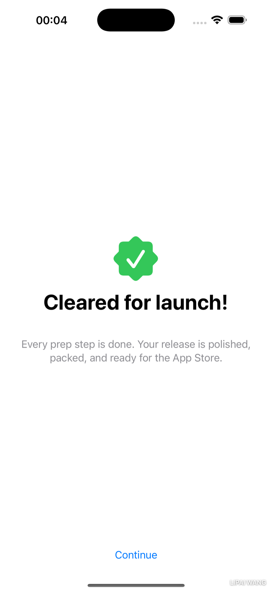
- Create a new SwiftUI View file named
ReadyView.swift. Set its preview to#Preview(traits: .sizeThatFitsLayout)so you see just the view, not a whole device. - Replace the boilerplate
Textwith aVStackcontaining a celebratory SF Symbol on top and a few lines of text below. - Use a fillable symbol such as
checkmark.seal.fill(a nod to the rating seals on the Step view), in a 75 × 75 frame, tinted green. Hint: your newfilled(width:height:)modifier works on anyImage, including an SF Symbol — then add.foregroundColor(.green). - Give the headline — say, "Cleared for launch!" — extra emphasis with the
fontWeightmodifier on alargeTitle. - For the supporting copy, use a single multi-line string and
multilineTextAlignment(.center), colored gray. The triple-quote"""literal in the Swift Style Guide is the clean way to write it across several lines. - Like
HistoryView, this screen needs a dismiss control — center a Continue button at the bottom. Hint: wrap everything in aZStack(alignment: .bottom)so the "Cleared for launch!" stack stays vertically centered while the button hugs the bottom edge.
Build it, preview it, and your prototype is complete — Welcome, Step, History, and Ready to Ship!, all laid out. You'll wire the Continue button (and History's ✕) to real actions in the next chapter, once you've learned how views hand data back to one another.
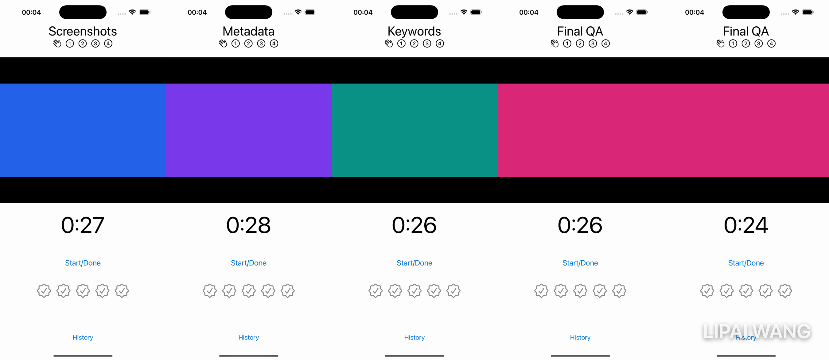
Here's the finished prototype, paging from Welcome through all four steps:
Key Points
- A
Dateis just an instant in time; configure aDateFormatter(setdateFormat, callstring(from:)) to render it as calendar text. Wrap that in aDateextension so callers writedate.formatted(pattern: "MMM d"). - Document your own methods with
///Quick Help comments — Option-clicking the method then shows a summary styled just like Apple's API docs. Formlays out grouped, settings-style rows for free;Sectionadds a header to each group.ForEachloops over a collection, and it must be able to identify each element. Make the elementIdentifiablewith anid: UUID(asShipDaydoes) and you can loop without anid:argument; for plain values likeString, passid: \.self.- Keep development-only data out of your shipped app with a
#if DEBUGcompiler directive and the Preview Content group, whose contents never reach a release build. ZStacklayers views along the z-axis — perfect for floating a dismiss button in a corner while the main content lays out as if it weren't there. The first child is the bottom layer.VStacktakes a horizontal alignment,HStacka vertical one, andZStacktakes both (or a combined value like.topTrailing).- Refactor ▸ Rename changes a symbol everywhere safely — far better than a blind find-and-replace.
- When the same modifiers always travel together (
resizable+aspectRatio+frame), fold them into a custom modifier onImageso you Don't Repeat Yourself. - A
Buttonhas anactionand alabel.Button("Title") { }is sugar for a string label; a trailing-closure label can hold any views — aTextand an SF Symbol, say.Labelpairs an icon with text but always leads with the icon.
Every screen is laid out, but nothing does anything yet: the buttons have empty actions, the timer is a stand-in, and the rating seals don't fill. To bring ShipShape to life, your views need to share and change data — the Step view has to tell HistoryStore "I finished this step," and HistoryView has to redraw when it does. You already know how to pass data into a view; next you'll learn how views hand data back and stay in sync with @State, @Binding, and observable models. That's where a prototype turns into an app.

Ultimate iOS Bootcamp: Master Swift & SwiftUI App THE HARD WAY
Ship your apps faster
When you're ready to publish your Swift app to the App Store, Simple App Shipper handles metadata, screenshots, TestFlight, and submissions — all in one place.
Try Simple App Shipper