Chapter 1 moved a view. Chapter 2 made views arrive and leave. This one is the case neither covers: a thing that is conceptually the same but is rendered by two entirely different views, in two different places, and has to get from one to the other.
A card in a grid, and the detail panel it opens into. The user believes those are the same object. Your code knows they are two unrelated View structs that have never met.
matchedGeometryEffect is how you tell SwiftUI they are the same thing.
The setup
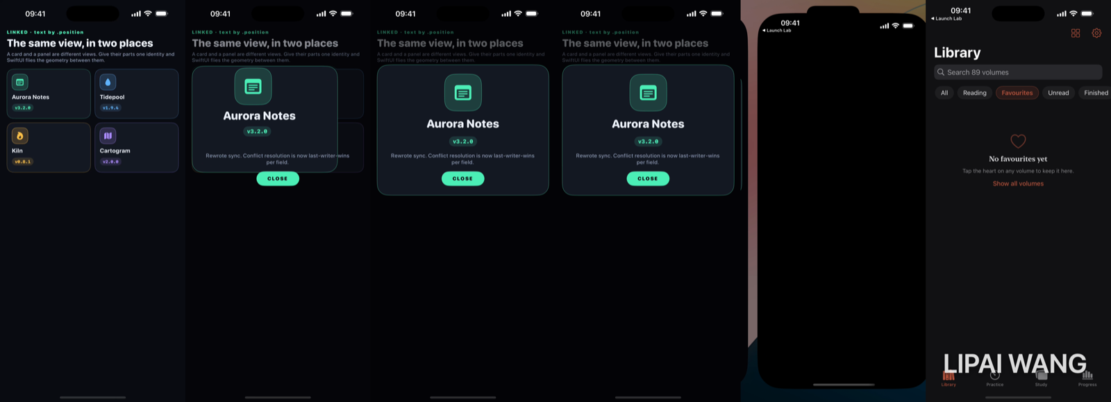
Four release cards in a grid. Tap one and it becomes a panel.
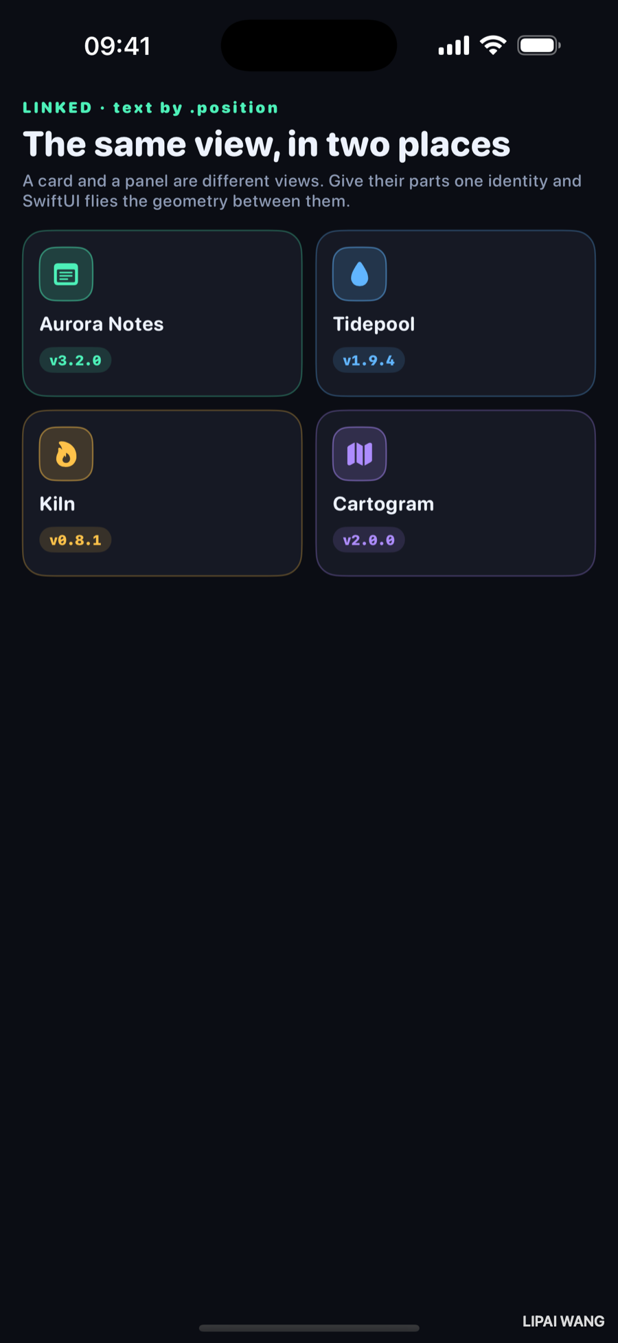
The card and the panel share three parts — an icon, a title, and a version chip — laid out completely differently. On the card the icon is 38 points and left-aligned above a 14-point title. On the panel it is 88 points, centred, above a 27-point title. Nothing about those two view trees is shared.
// On the card
HeroIcon(release: release, size: 38, corner: 11)
  .matchedGeometryEffect(id: "icon-\(release.id)", in: namespace)

// On the panel
HeroIcon(release: release, size: 88, corner: 24)
  .matchedGeometryEffect(id: "icon-\(release.id)", in: namespace)
Same id, same namespace. That is the whole API surface, and it is doing something quite specific:
matchedGeometryEffect does not move a view. It makes one view adopt another view's geometry.When the pair is animating, SwiftUI takes the frame of the view marked as the source and hands it to the other one, interpolating between them. Both views exist. Neither travels. What travels is a rectangle.
The namespace is what scopes the ids, and you declare it where both halves can see it:
@Namespace private var heroIf the two halves end up with different namespace instances — a common accident when you split views into files and each declares its own @Namespace — nothing happens at all. No warning, no crash, just a plain fade. Pass the namespace down as a Namespace.ID property rather than declaring a second one.
The source has to leave
Here is the part that trips people up structurally. When a card opens, that card is removed from the grid and replaced by an empty slot:
// The opened card leaves an empty slot behind. It has to actually go —
// a matched pair with both halves on screen has two candidate frames and
// SwiftUI has no way to pick, so it jitters.
if opened?.id == release.id {
  Color.clear.frame(height: 118)
} else {
  CardView(release: release, mode: mode, namespace: hero)
}
If both halves of a matched pair are on screen and both are sources, you have told SwiftUI that one identity has two frames. It resolves that per frame, and the result is a view that vibrates between two positions. The isSource: parameter exists for the cases where you genuinely need both present — mark exactly one as the source and the other follows it.
The empty slot matters too. Without it the grid reflows the moment a card leaves, so the remaining cards slide sideways while the hero flies — two animations competing for the same glance. Same lesson as chapter 2's reserved cells, in a new costume.
Here it is working
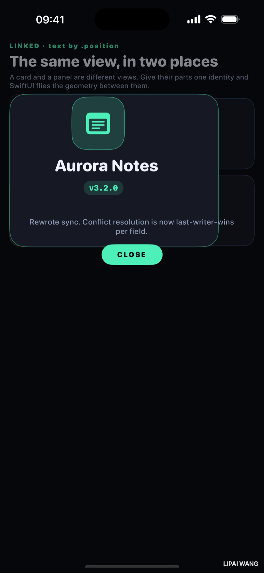
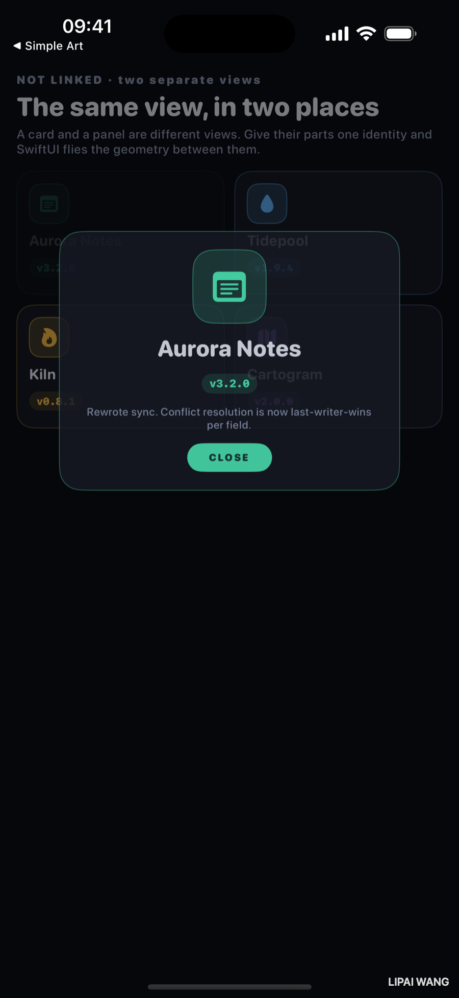
The icon has flown and grown. The title and chip are at their destination sizes and reading in full. The shell — the rounded rectangle behind everything — is on its way from card-sized to panel-sized.
That shell is matched too, and it took me three tries to work out why it had to be.
Three ways this goes wrong
1. Matching text by frame
Change one parameter and the same handoff produces this:
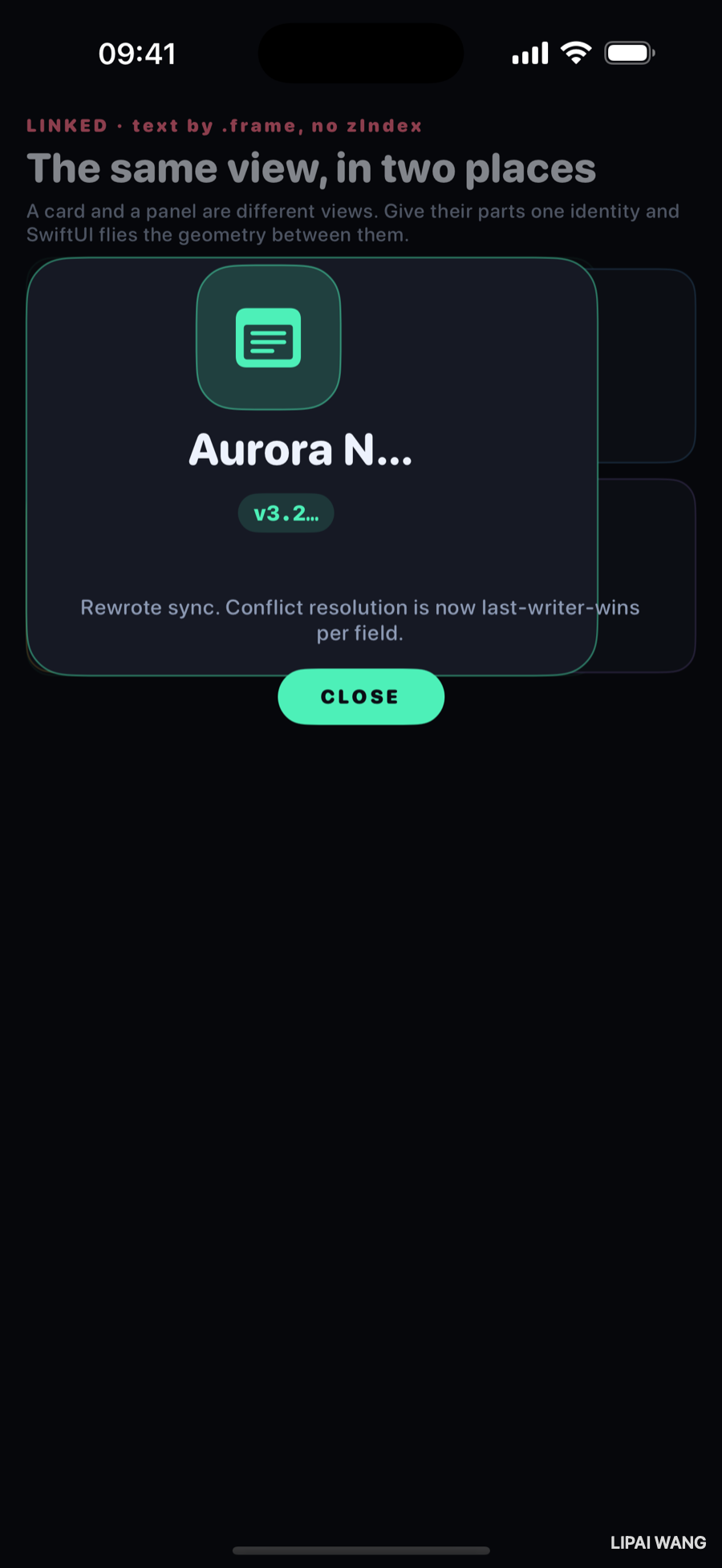
Aurora N… and v3.2…. The layout is identical, the animation is identical, and the text is being destroyed.
// Truncates:
.matchedGeometryEffect(id: "title-\(release.id)", in: namespace)                        // properties: .frame
// Reads correctly:
.matchedGeometryEffect(id: "title-\(release.id)", in: namespace, properties: .position)
properties: defaults to .frame, which means position and size.For a shape that is what you want — the icon really should be 38 points at one end and 88 at the other, and interpolating the size is the effect.
For text it is destructive. A 27-point label squeezed into a 38-point-wide card frame has nowhere to put its glyphs, so it truncates, and you watch a title dissolve into an ellipsis and back on every single transition. Match text by .position and let it keep its own size the whole way.
The rule that falls out of it: shapes want .frame, text wants .position. The version chip in this bench is text wearing a capsule, and it needed .position for the same reason — the first build had it on .frame and it read v3.2… in the correct mode, which is how I found this.
2. Forgetting that the destination has nothing underneath it
The first working build looked like this mid-flight: the panel readable, but three untouched cards showing straight through it.
That is not a bug in matchedGeometryEffect. It is a consequence of something the API deliberately does not do:
The destination panel is still a newly inserted view, and an inserted view still runs its transition — by default, a fade. For most of the flight it is partly transparent. The source card, meanwhile, has been removed from the tree entirely, so there is nothing fading out underneath to make up the difference.
Geometry is linked. Opacity, content, and stacking are all still your problem.
Two things fixed it, and both are worth stealing:
Match the shell, not just the contents. Give the card's background and the panel's background one identity, and the container itself grows from one into the other — opaque the whole way, because it is a continuation of something that was already opaque:
.background(
  RoundedRectangle(cornerRadius: 16, style: .continuous)
    .fill(Lab.panel)
    .matchedGeometryEffect(id: "shell-\(release.id)", in: namespace, properties: .frame)
)
Then stop the panel fading in at all. Once the shell carries the container across, a fade on top of it is just haze:
.transition(.identity) // the shell already brings it inThe parts with no counterpart on the card — the release note, the close button — keep their own .opacity transition, because they genuinely are arriving from nothing.
A scrim behind the panel is the third piece, and it is a design decision rather than a fix: it separates the two layers and gives the user something to tap to dismiss.
3. Expecting it to morph
Look closely at the working frame again. The panel's content — title, chip, note, button — is already laid out at its final size, while the shell behind it is still three-quarters grown. The close button is briefly outside the shell entirely.
The destination view is laid out at its destination size from the very first frame. Only the frames of the specifically matched views are being interpolated. So a shell that flies while its content is already final will spill, and text that changes size will jump to its new size and then travel — it never grows through the intermediate sizes.
This is also why matchedGeometryEffect is not a morph. Two different views crossfade at linked geometry. If they look different, you see both.
If you need the content to scale with the container, you scale it yourself — scaleEffect driven by the same state — or you clip the content to the shell so the spill is hidden. Knowing which of those you want is the actual design work; the modifier only gets you the rectangle.
What you lose without it
For comparison, the same bench with every matchedGeometryEffect removed and nothing else changed:
The panel is fine. It scales and fades in perfectly pleasantly, and a year ago you would have shipped it. What is missing is the claim that the thing you tapped and the thing that opened are the same object. The user's eye has to re-find the icon instead of following it.
That is the whole value proposition, and it is worth being precise about: matchedGeometryEffect does not make the animation smoother. It makes it legible.
Mini-exercise
Run the bench in all three modes back to back — correct, .frame-matched text, and unlinked. The unlinked one is the one that looks least broken while being the one that communicates least. That gap between "looks fine" and "reads right" is most of what motion design is.
Challenges
-
Give the icon a corner-radius handoff. The card icon is an 11-point radius and the panel icon 24. Matched geometry moves the frame but the radius jumps. Animate it — you will need a value you own rather than one SwiftUI infers.
-
Break the namespace on purpose. Declare a second
@NamespaceinsideDetailPanelinstead of taking one as a parameter. Everything compiles, nothing warns, and the handoff silently stops. Sit with how quiet that failure is. -
Make both halves visible at once by rendering the card instead of the empty slot while a panel is open. Watch the jitter. Then fix it with
isSource: falseon one side and read the difference. -
Scale the content with the shell. Fix the spill from the third failure by driving a
scaleEffecton the panel's content from the same open/closed state, so the content grows as the shell does. Then decide whether you actually prefer it — instant-size content is what iOS itself usually does. -
Chain three states. Add a middle "peek" size between card and panel and match across all three. Anything that survives two hops is usually correct; anything that only ever worked between two views usually was not.
Key Points
matchedGeometryEffectmakes one view adopt another's geometry. Nothing travels; a rectangle is interpolated between two views that both exist.idplus@Namespacedefine the link. Two different namespace instances fail silently — pass aNamespace.IDdown rather than declaring a second one.- One source at a time. Both halves visible and both sources means one identity with two frames, and it jitters. Remove the source, or mark one
isSource: false. - Shapes want
.frame, text wants.position. The default is.frame, and on text it squeezes glyphs into the other end's box and truncates them. - It links geometry and nothing else. The destination still runs its transition, so match the shell and drop the fade, or accept a translucent panel with nothing behind it.
- It interpolates frames, not layout. Destination content is laid out at final size from frame one, which is why a flying shell spills and why this is a crossfade rather than a morph.
- The point is legibility, not smoothness. Without it the animation still looks fine; it just stops telling the user that these two things are one thing.
The next bench leaves motion behind for a while. Every chapter so far has animated a value that SwiftUI already knew how to interpolate, or borrowed one via Animatable. The next question is what happens when the thing you want to animate is a shape — a path that has to be redrawn at every intermediate value, not just moved.
Read next
Ship your apps faster
When you're ready to publish your Swift app to the App Store, Simple App Shipper handles metadata, screenshots, TestFlight, and submissions — all in one place.
Try Simple App Shipper