Six chapters about what SwiftUI does with a view once it exists. This one is about how it decides how big it is — and the answer surprises people, because the parent has less power than the name suggests.
There is no layout engine solving constraints here. There is a conversation, and it has three turns:
- The parent proposes a size to the child.
- The child chooses its own size. It may take the proposal, take less, or take more.
- The parent places the child, and sizes itself around what the child chose.
Step two is the one that matters. A proposal is exactly that — the child is under no obligation.
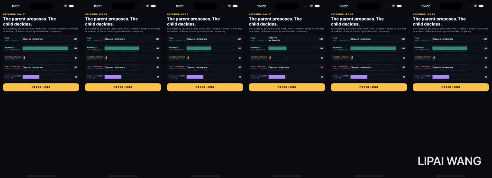
The instrument
Five dashed boxes, all exactly the same width, each containing one candidate. The number on the right is the width that candidate actually took, measured from the rendered result:
candidate.view
  // iOS 18's geometry reader replacement: reports size changes without
  // the state-during-layout hazard the old GeometryReader pattern had.
  .onGeometryChange(for: CGFloat.self) { $0.size.width } action: { chosen = $0 }
The boxes are deliberately not clipped. That is the whole design:
/// The box is deliberately *not* clipped. A child that chooses to be wider than
/// the space it was offered will simply be wider than the box, which is the
/// single most useful thing to see on this screen.
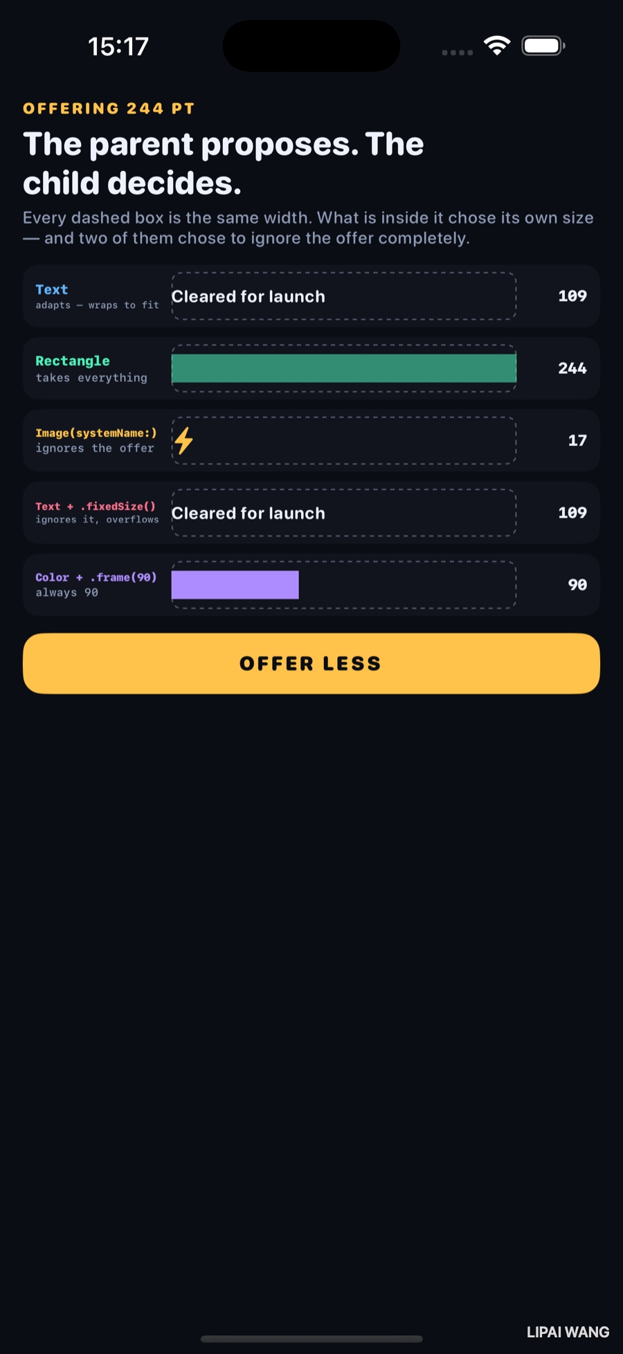
Offering 244 points, everything looks reasonable:
Now offer 96:
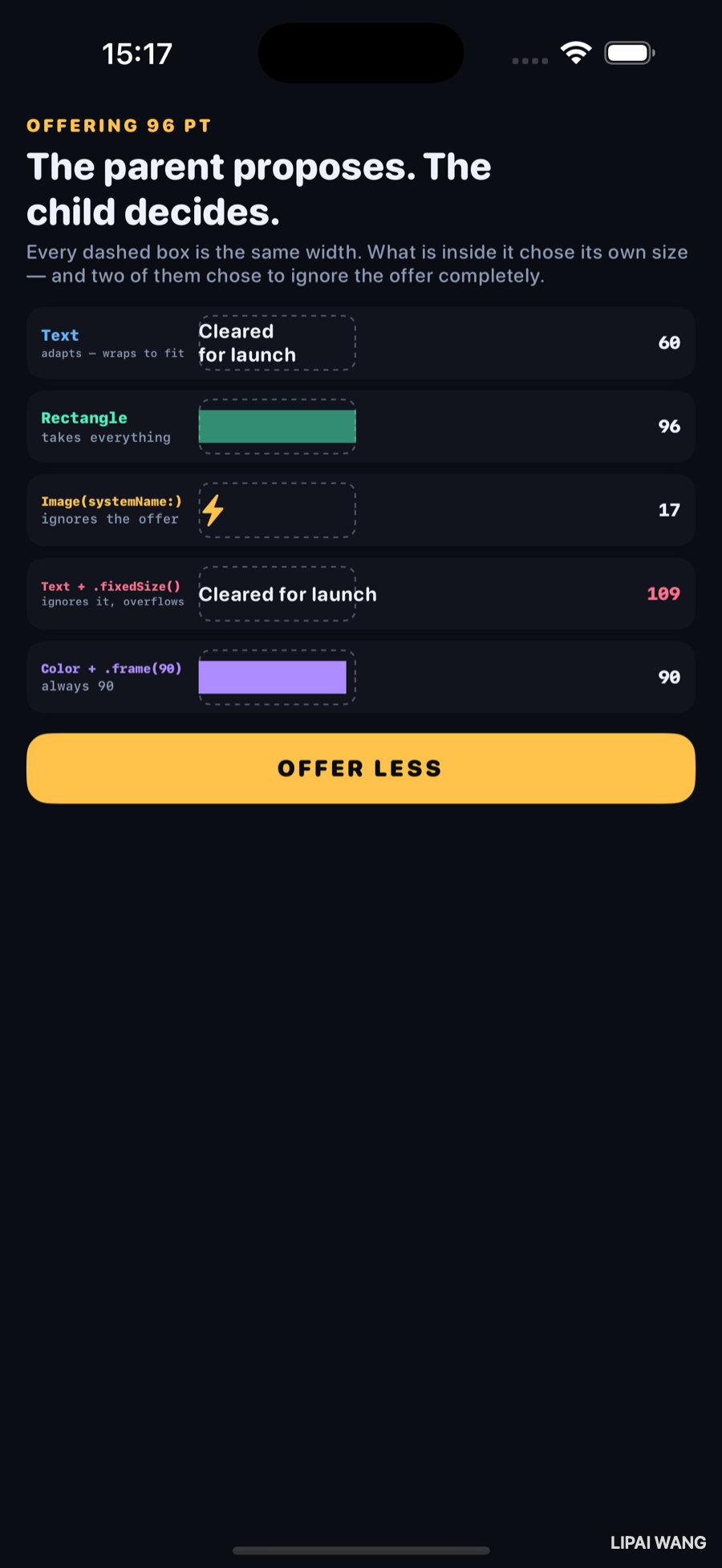
| Candidate | Offered 244 | Offered 96 | What it did |
|---|---|---|---|
Text | 109 | 60 | Wrapped to two lines and took less than offered |
Rectangle | 244 | 96 | Took exactly what was offered, both times |
Image(systemName:) | 17 | 17 | Ignored the offer entirely |
Text().fixedSize() | 109 | 109 | Ignored it and overflowed the box |
Color.frame(width: 90) | 90 | 90 | Always 90 |
Four kinds of answer
Flexible — Rectangle, Color, any Shape, Spacer. These have no opinion, so they take whatever they are handed. This is why a bare Color fills its parent and why a Rectangle in a stack expands: not eagerness, just the absence of a preference.
Adaptive — Text is the archetype. It has an ideal size, and when offered less it looks for a way to fit: wrap, then shrink if you allowed it, then truncate. Notice it took 60 when offered 96 — a child can choose less than proposed, and text does this constantly because its wrapped lines rarely fill the width exactly.
Fixed — Image without .resizable(), and anything wearing a .frame(width:). The offer is ignored; the answer is a constant. .resizable() is the modifier that moves an Image from this group into the flexible one, which is why forgetting it is one of the first things everyone gets wrong.
Neutral — most containers and most modifiers. They have no size of their own, pass the question down, and report back whatever their child said.
.fixedSize() means "ignore the proposal and use your ideal size", and the fourth row does exactly that: offered 96, took 109, and rendered straight through the side of its box.
SwiftUI will not stop it, warn about it, or clip it. The parent asked, the child said no, and the parent's job is now to place a child that does not fit. This is the single most common source of "why is my label sticking out of its card" — and the fix is a .frame(maxWidth:) plus removing the .fixedSize(), not one or the other.
Mini-exercise
Add a sixth row containing Text("Cleared for launch").lineLimit(1). Offer it 96. It takes 96 and truncates with an ellipsis — a third distinct strategy for the same conflict. Adaptive views negotiate; how they negotiate is something you configure.
.frame() does not resize anything
This is the sentence that unlocks the modifier.
Text("Cleared for launch")
  .frame(width: 90)
You have not made the text 90 points wide. You have wrapped it in a new view that is 90 points wide, which proposes 90 to the text, and then positions whatever the text chose inside itself — centred by default.
That is why the fourth row overflows: .fixedSize() makes the text refuse the proposal, and the frame around it stays 90 while its content is 109. Both views are behaving correctly and the result looks broken.
Text("Ship it")
  .frame(width: 100)
  .background(.mint)
  .frame(width: 200)
Four views, from the inside out: the text, a 100-wide frame around it, a background attached to that, and a 200-wide frame around all of it. The mint fills 100 points, not 200 — because the background belongs to the inner frame. Modifier order is view nesting, and reading it outward makes almost every "why is my background the wrong size" question answer itself.
.frame(maxWidth: .infinity) fits the same rule: the frame view takes everything it is offered, then proposes that width onward. The child still gets to refuse.
How stacks divide
A stack has one proposal to share between several children, and it does not split it evenly. It hands space out least flexible first: children with a fixed size are asked first and subtract what they take, then what remains is divided among the flexible ones.
That ordering is the reason a Spacer next to a Text does not squash the text — the text is asked first, takes what it needs, and the spacer absorbs the remainder. Spacer is not empty space; it is a maximally flexible view whose job is to take whatever nobody else wanted.
layoutPriority(_:) overrides the order. Raise it on the view that should be asked first, and it gets its full ideal size before anything else is considered. It is the right tool when two adaptive views are competing and the wrong one is winning.
The first build of this screen came out shifted sideways with both edges cut off. Each row was a label column plus a 292-point box plus a readout — about 452 points of content on a 408-point screen. The row chose to be wider than it was offered; its parent, having no way to refuse, centred the overflow and let both ends run off the display.
A layout chapter, broken by the exact rule it was written to explain. The fix was arithmetic, not a modifier: make the parts add up to less than the space available.
Challenges
-
Find the third strategy. Add rows for
.lineLimit(1),.minimumScaleFactor(0.5), and.truncationMode(.middle)and offer all three 96 points. Three different answers to the same conflict, on screen together. -
Break a stack on purpose. Put two
Texts of very different lengths in anHStackand shrink it until one truncates. Then give the truncated one.layoutPriority(1)and watch the other one lose instead. Neither is correct in general — you had to decide. -
Make
.framevisible. Add.border(.red)to a view and.border(.blue)to the same view after a.frame(width: 200). The two rectangles are usually different, and the gap between them is what.frameactually did. -
Measure a
GeometryReader. Put one inside a probe box and read its chosen width. It takes everything offered even when its content is tiny — the most common reason aGeometryReader"breaks" a layout it was only meant to observe.onGeometryChangeexists partly to avoid this. -
Write a
Layout. ImplementsizeThatFits(proposal:subviews:cache:)andplaceSubviews(...)for a two-column layout, and print theProposedViewSizeyou receive. Seeingnilarrive as a dimension — which means "what is your ideal size?" — makes.fixedSize()stop being magic.
Key Points
- Layout is a three-turn conversation: the parent proposes, the child chooses, the parent places and sizes itself around the result. Only step two decides the size.
- A proposal is not a constraint. Children can take it, take less, or take more, and taking more is legal and unclipped.
- Four kinds of child: flexible (shapes, colours,
Spacer), adaptive (Text), fixed (Imagewithout.resizable(), anything with a fixed.frame), and neutral (most containers, which pass the question down). .frame()does not resize a child. It creates a new view of that size, proposes it inward, and positions whatever came back.- Modifier order is view nesting. Read a chain outward and background-size surprises explain themselves.
.fixedSize()means "ignore the proposal." It is the direct cause of most content overflowing its container.- Stacks serve the least flexible children first, which is why
Spacer— a maximally flexible view, not blank space — absorbs the remainder instead of squashing the text. layoutPrioritychanges who is asked first, and is the tool for two adaptive views competing over the same space.
Seven chapters. The Lab has covered motion, what motion is built on, what makes it re-run, and now how big any of it is. The next bench leaves the phone screen entirely for the thing every one of these demos has quietly relied on and none has examined: how a view becomes something a person can actually use — focus, hit targets, VoiceOver, and the parts of an interface that are invisible until they are the only thing that matters.
Read next
Ship your apps faster
When you're ready to publish your Swift app to the App Store, Simple App Shipper handles metadata, screenshots, TestFlight, and submissions — all in one place.
Try Simple App Shipper