Seven chapters about what an interface does. This one is about what it does for someone who is not using it the way you are.
Accessibility work has a specific failure mode that nothing else in this series shares: you cannot see the bug on your own device. A motion bug is visible, a layout bug is visible, a re-render bug shows up as jank. An unlabelled button looks perfect. It looks perfect in review, in TestFlight, and on the App Store.
So this bench does not argue. It measures.
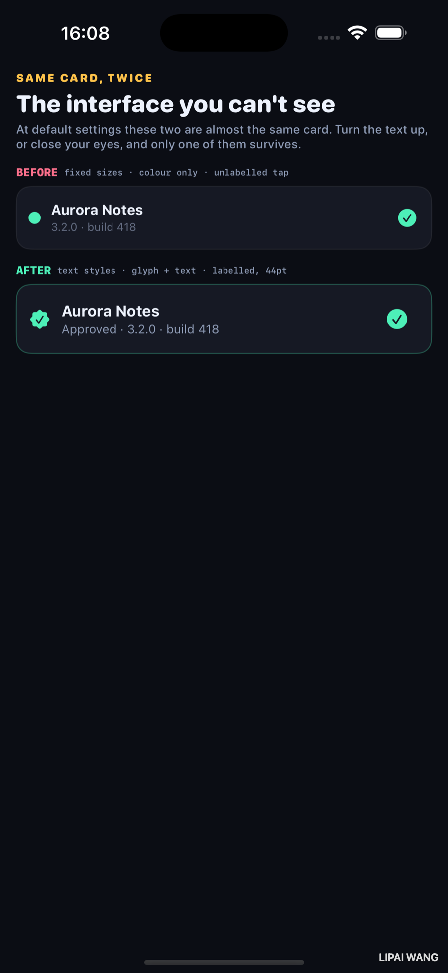
Two builds of the same release-status card. At default settings they are near-identical, which is the entire problem — everything below was invisible until it was measured.
Measurement one: turn the text up
simctl can set the preferred content size category, so this is one command rather than an opinion:
xcrun simctl ui <udid> content_size accessibility-extra-extra-extra-large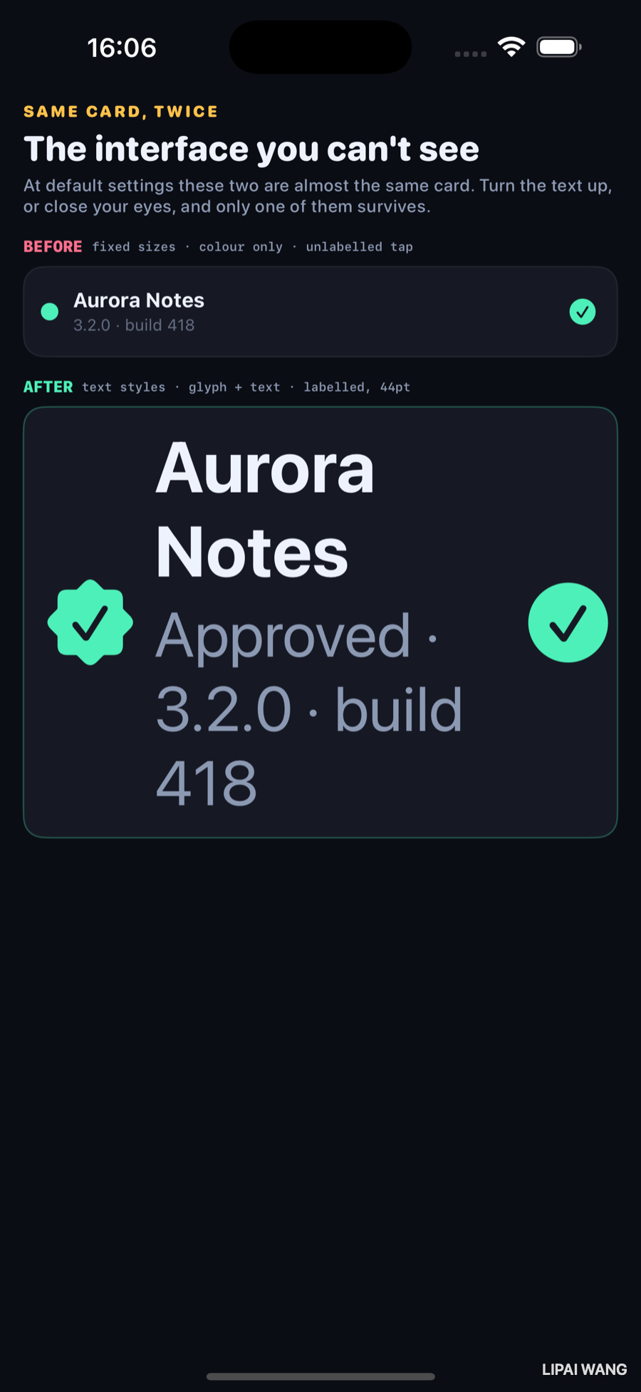
The AFTER card grew, wrapped, and pushed its own container taller. The BEFORE card is pixel-for-pixel identical to the previous screenshot.
That is worth sitting with. It did not clip, or truncate, or break. It simply ignored the user's setting completely, because of this:
// `.system(size:)` is a fixed point size. It does not respond to
// Dynamic Type at all.
Text("Aurora Notes")
  .font(.system(size: 14, weight: .bold))
Font.system(size:) is opt-out, and it does not look like opting outA hard-coded point size never scales. The user turned their text up to the largest setting the system offers — a setting people use because they otherwise cannot read the screen — and this card did not move.
The alternatives both scale: a text style (.subheadline, .caption, .body) is the right default and carries semantic weight for free, and .system(size:14, relativeTo: .subheadline) scales a custom size against a style when you genuinely need a specific number.
The AFTER card uses styles:
Text("Aurora Notes")
  // A text style, so it tracks Dynamic Type without any extra work.
  .font(.subheadline.weight(.bold))
And it drops the fixed height, so the container grows with its content:
// No fixed height: the card grows with its content instead of clipping it.Every bench in Launch Lab uses .system(size:) throughout, because the benches are diagrams that need exact proportions for screenshots. That is a real reason and it is still a real failure — a shipping app has no such excuse, and the honest thing is to name it rather than quietly exclude the demo from its own chapter.
Measurement two: dump the tree a screen reader actually walks
VoiceOver does not read your source. It reads the accessibility hierarchy — and XCUITest walks the same tree, so it can be printed:
/// The chapter's claim is that the two cards expose different numbers of
/// elements with different labels. That is checkable rather than assertable:
/// XCUITest walks the same tree VoiceOver does, so this prints what a screen
/// reader would actually find.
func testDumpAccessibilityTree() {
  let app = XCUIApplication()
  app.launchArguments = ["-bench", "accessibility", "-bare"]
  app.launch()
  print(app.debugDescription)
}
xcodebuild test -project LaunchLab.xcodeproj -scheme LaunchLab \
-destination 'id=<udid>' -only-testing:LaunchLabAXTestsHere is the real output, trimmed to the two cards:
BEFORE
  StaticText, {{50.0, 197.8}, {91.0, 17.0}},   label: 'Aurora Notes'
  StaticText, {{50.0, 216.8}, {84.0, 13.3}},   label: '3.2.0 · build 418'
  Button,     {{391.0, 205.0}, {18.0, 18.0}},  identifier: 'checkmark.circle.fill',
                                               label: 'Selected'

AFTER
  Image,      {{29.3, 303.7}, {19.7, 19.7}},   identifier: 'checkmark.seal.fill',
                                               label: 'Verified'
  StaticText, {{60.3, 296.2}, {155.3, 34.3}},  label: 'Aurora Notes, version 3.2.0, build 418',
                                               value: Approved
  Button,     {{368.0, 291.3}, {44.0, 44.0}},  identifier: 'checkmark.circle.fill',
                                               label: 'Toggle review decision',
                                               value: Approved
Three findings, none of which I would have written down without running it.
The status is not in the tree at all
The BEFORE card shows status as a coloured dot:
// Status carried by colour alone. Nothing to read, nothing to see if you
// cannot separate red from green.
Circle()
  .fill(approved ? Lab.mint : Lab.rose)
  .frame(width: 12, height: 12)
Search that dump for it. It is not there. A bare Shape has no text, so SwiftUI exposes no element — the single most important fact on the card is absent, not merely badly described. A screen reader user is not told the release was approved; they are not told there is a status at all.
Colour-only status also fails for roughly one in twelve men with red-green colour blindness, before any screen reader is involved. The AFTER card carries the same fact on three channels — glyph, colour, and text — so losing any one of them still leaves the meaning:
Text("\(statusText) · 3.2.0 · build 418")The unlabelled button is labelled 'Selected'
Not blank — which would at least look wrong. SwiftUI fell back to the SF Symbol's state, so VoiceOver announces "Selected, button". That is a plausible-sounding string carrying no information about what the button does or what it applies to.
The AFTER button says what it does, what state it is in, and what will happen:
.accessibilityLabel("Toggle review decision")
.accessibilityValue(statusText)
.accessibilityHint("Switches Aurora Notes between approved and rejected")
Label is what it is. Value is its current state, and it must change when the state does — a label of "Approved" is a bug the moment the value flips. Hint is what happens if you activate it, and it is optional; VoiceOver users can turn hints off, so nothing essential belongs there.
The 18×18 button, and why the frame did not help
This is the number I did not predict. The BEFORE button asks for a 24-point frame:
Image(systemName: …)
  .font(.system(size: 18))
  .frame(width: 24, height: 24)
The tree reports 18×18 — the glyph, not the frame.
.frame() does not extend a hit region. .contentShape() does.Chapter 7's rule, arriving from a different direction: .frame creates a view of that size and positions the child inside it. The interactive and accessible region still follows the child's own drawn content — the glyph — unless you say otherwise.
.frame(width: 44, height: 44)
.contentShape(Rectangle())
With both, the tree reports exactly 44×44. Apple's documented minimum target is 44 points, and the gap between "I set a frame" and "the target is actually that big" is one modifier wide.
One element instead of three
The BEFORE card exposes the name and the version as two separate stops. A VoiceOver user swipes, hears "Aurora Notes", swipes again, hears "3.2.0, build 418" — two gestures to assemble one idea, on every row of a list.
// One element instead of three fragments, with a sentence a person would
// actually say and a value that changes when the state does.
.accessibilityElement(children: .combine)
.accessibilityLabel("Aurora Notes, version 3.2.0, build 418")
.accessibilityValue(statusText)
children: .combine merges the descendants into one stop; the explicit label then replaces the concatenation with a sentence. Note "version 3.2.0" rather than "3.2.0" — labels are spoken, and the reason to write them by hand is that a synthesiser reads text you would never read aloud.
children: behaviours.combine— merge descendants into one element, concatenating their labels. What you want for a card or a row..ignore— hide the descendants entirely; you supply the label. The default when you call.accessibilityElement()with no argument, and the reason people accidentally erase their own content..contain— keep children individually reachable but group them, so the rotor can jump between groups.
Contrast, since it is measurable too
The BEFORE card's version line is Lab.dim.opacity(0.65) on a dark panel. The published thresholds are 4.5:1 for text at 17pt or below and 3:1 above it — and dropping the opacity on already-muted secondary text is the most common way to slide under them.
Contrast is the one item here that neither screenshot nor tree dump catches automatically. Xcode's Accessibility Inspector has an audit tool that will, and it runs against a simulator in about ten seconds.
Challenges
-
Run the audit. Open Accessibility Inspector, point it at this bench, and run an audit on each card. Compare its findings to the three above — it catches things the tree dump does not, and misses things only reading the code reveals.
-
Break the value. Change the AFTER card's
.accessibilityValueto a hard-coded"Approved". Toggle the button. Everything looks right and VoiceOver now lies — the failure mode that makes stale values worse than missing ones. -
Add a test that fails. Write
XCTAssertTrue(app.buttons["Toggle review decision"].exists)and point it at the BEFORE card instead. Now the accessibility requirement is in CI, where it belongs. -
Measure the whole app. Run the tree dump against the other seven benches. Count the elements with no label. Every one is a chapter this series has already shipped.
-
Try one-handed reach. Set the largest text size and use only the bottom third of the screen. Dynamic Type is not only about eyesight — it is the setting that most often reveals a layout that was never tested outside its default.
Key Points
- Accessibility bugs are invisible on your own device, which is why they need measurement rather than review. Both instruments here are one command.
Font.system(size:)never scales. Use text styles, or.system(size:relativeTo:). A card that ignores the largest accessibility setting does not look broken — it looks unchanged.- Fixed heights clip what does grow. If text can scale, its container has to.
- Colour alone exposes nothing. A bare
Shapeproduces no accessibility element at all, so a colour-only status is absent from the tree rather than badly described. Carry meaning on a glyph and text as well. - An unlabelled icon button is not blank — it inherits something plausible and useless, like
'Selected'. Label, value, hint: what it is, what state it is in, what happens next. .frame()does not extend a hit region;.contentShape()does. A 24-point frame measured 18×18; addingcontentShapeto a 44-point frame measured exactly 44×44..accessibilityElement(children: .combine)turns a row into one stop, and a written label turns a concatenation into a sentence.- Contrast has numbers: 4.5:1 at 17pt and below, 3:1 above. Accessibility Inspector's audit checks them.
Eight chapters. This one closes the arc that began with a five-lane drag race: motion, its substrate, its cost, its size, and now who it is actually for. The next bench goes somewhere none of these have — off the device, to what happens when the data a view is drawing has not arrived yet.
Read next
Ship your apps faster
When you're ready to publish your Swift app to the App Store, Simple App Shipper handles metadata, screenshots, TestFlight, and submissions — all in one place.
Try Simple App Shipper