Mortal Kombat
6 screenshots
Mortal Kombat — App Analysis & Design Review
Overview
Mortal Kombat is a app. We've captured 6 unique screenshots across 4 distinct screen types, giving you a comprehensive look at their UI design patterns.
UI Design Breakdown
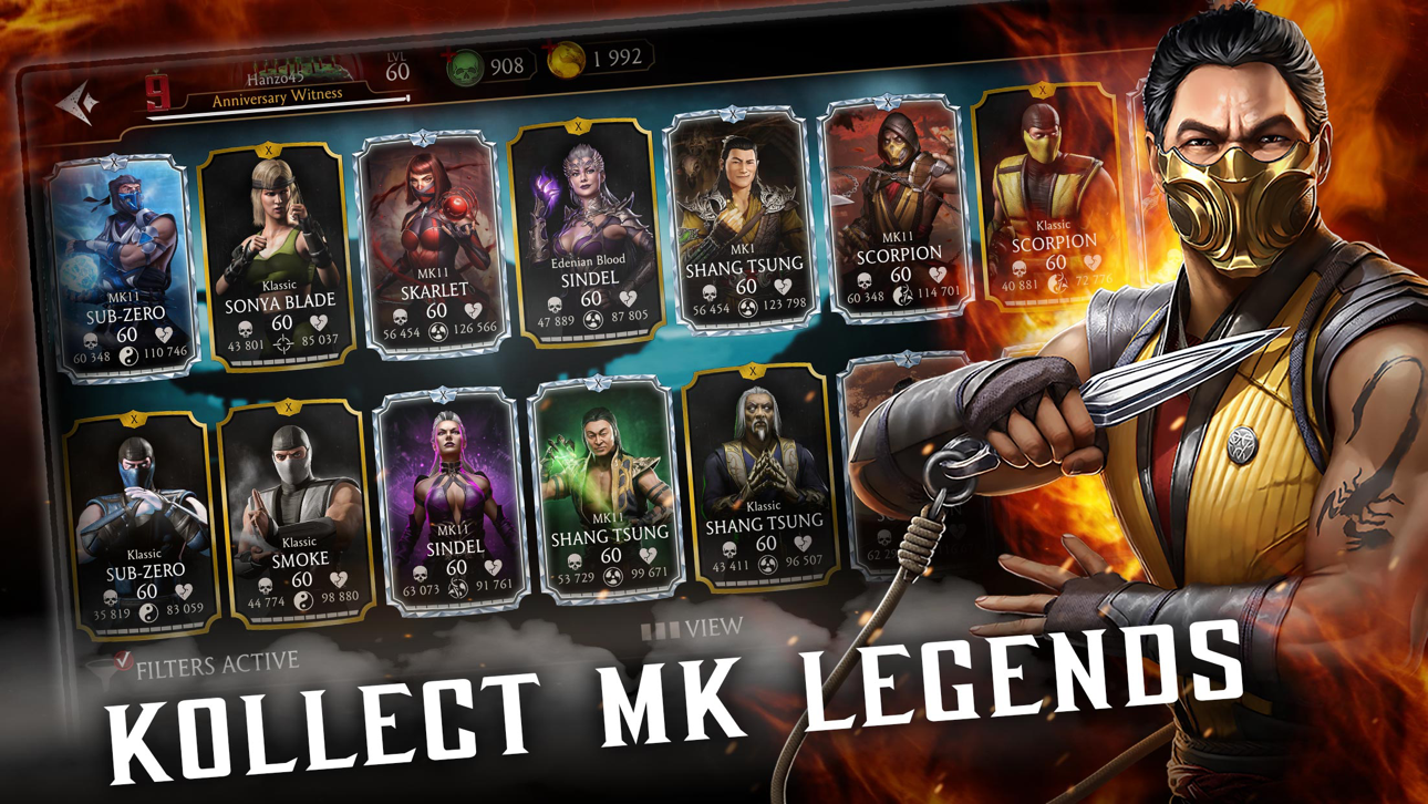
- Home Screen (1) — The main interface establishes the core value proposition and primary navigation pattern.
- Onboarding (1) — The onboarding flow introduces key features and guides new users through initial setup.
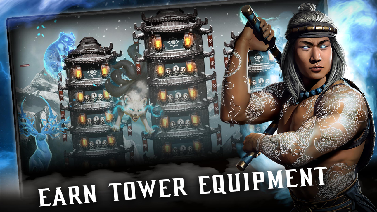
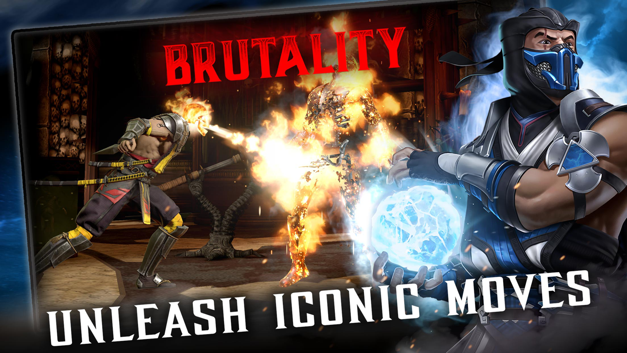
- Feature Screens (2) — Deep-dive into the app's core functionality and interaction patterns.
- Settings (2) — Configuration and customization options reveal the app's flexibility and user control approach.
Market Position
Mortal Kombat competes in the category on the App Store.
Design Takeaways
Designers and developers can learn from Mortal Kombat's approach to progressive onboarding that reduces friction for new users, clear information hierarchy on the home screen, consistent visual language across multiple screen types.
Total Screens
6
Unique screenshots captured
Screen Types
4
home, onboarding, features, settings
Category
—
com.wb.MK.Brawler2015
Rating
—
No rating data
All Screenshots 6
#1

#2

#3
#4

#5
#6